Think of this as a flowchart written in paragraphs. Piedmont and Priorat are both drawn from the same source material at the studio — Natural Earth's 1:10m rivers and coastline, public-domain geography rendered honestly — but they are almost opposites as maps on a wall. One is Italian, threaded by the Tanaro, anchored by Alba, Asti and Barolo, held together by Nebbiolo and the fog that gives the Langhe its shape. The other is Catalan, cut by the Siurana, anchored by Falset, Gratallops and Porrera, defined by the llicorella slopes where Garnatxa clings to broken slate. We will ask you three questions. Answer them in order.
Question 1: Are You Drawn to Fog on a River, or to Stone on a Slope?
This is the first fork because it is the honest one. Before appellation lines or grape names, a wall map lives or dies on the atmosphere it carries into a room. Piedmont and Priorat carry two very different atmospheres, and the geography under them is why.
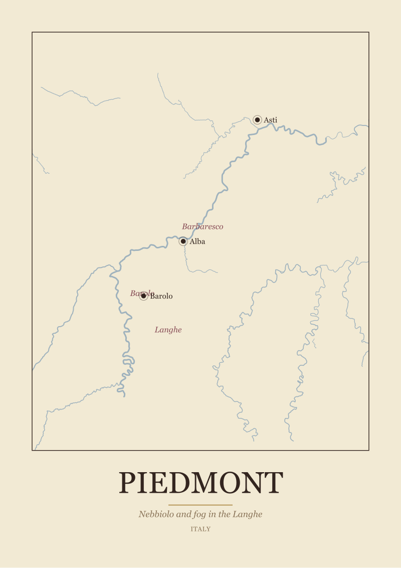
Piedmont, at its heart, is a river region. The Tanaro comes down from the Ligurian side of the Apennines, curves north-west through the wine country, and gathers the Langhe on one bank and Roero on the other before joining the Po. That river is the reason the region has fog. Cool air from the water settles into the low ground at night, the slopes above rise out of it in the morning, and the local word for this — nebbia — sits inside the name of the grape that made the place famous. Nebbiolo ripens late, holds on into October, and the ridge villages of Barolo and Barbaresco spent centuries learning to work around that fog rather than against it. On a wall, a Piedmont map reads as soft topography: a river that meanders, hill towns strung along ridgelines, Alba and Asti as anchor points a reader recognises even without a legend.
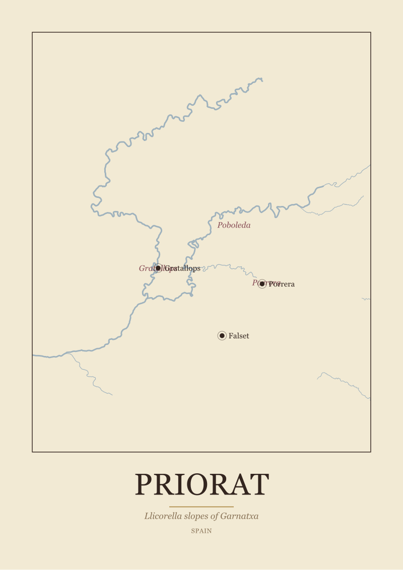
Priorat is not that. Priorat is a stone region. The Siurana river runs through the middle of it, but the river is a cut, not a valley — the country around it climbs sharply, and the vineyards live on those climbs. The soil is the story every guide has to tell eventually: llicorella, a broken black-and-copper slate that fractures into shards and forces vine roots to descend metres in search of water. Garnatxa grown on that slate is what put the tiny villages of Gratallops, Porrera and Poboleda on the wine world's map in the 1990s, but the geography is older than the fame by a long way. On a wall, a Priorat map reads as amphitheatre: tight contours, a river cutting through, a handful of hilltop villages that a viewer can hold in their head at once because the whole DO is roughly the size of a large city's outer ring.
If Yes to Fog on a River
Go with Piedmont. You are answering, honestly, that the geography you want to look at every day is one of drift and depth — a river you can trace with a finger, ridges that make sense once you know the fog sits below them, and a name-catalogue (Alba, Asti, Barolo, Barbaresco, Langhe) that most guests at your table will half-recognise. A Piedmont map on a wall does the same thing a Piedmont vineyard does: it tells you where the low ground is, and lets you infer everything else.
If Yes to Stone on a Slope
Go with Priorat. You are saying that what belongs on your wall is not a soft, rolling geography but a compact, vertical one — a wine region small enough that its slate slopes and its village names occupy the same visual field. Priorat as a map is honest about its scale: a horseshoe of hills around the Siurana, ten-odd villages, and a texture (llicorella) that any decent print of the region should hint at even without labelling it. It is a wall piece for someone who wants the map itself to feel like the wine.
Question 2: Do You Want a Region You Can Wander, or an Amphitheater You Can Read at a Glance?
The second question is about scale, and it is closer to a design decision than a wine one. Piedmont and Priorat are not the same size and they do not want to be printed the same size. A map does the region a disservice when its geographic scale and its wall scale disagree.
Piedmont is a wanderer's region. The wine country alone — Langhe, Roero, Monferrato, and the sub-zones inside each — covers a serious stretch of north-west Italy, and the map has to accommodate that. The Tanaro runs through it for tens of kilometres before it exits the frame. Barolo sits in one cluster of villages; Barbaresco sits in another, north across the river; Asti and its Moscato hills sit further north again. A good Piedmont print gives you room to follow a road with your eye from Alba out to any of these. It rewards being looked at for a minute, not a second. On a wall, it wants space — the kind of piece that anchors a longer wall, or hangs above a table where people spend time.
Priorat is the opposite. The DO is one of the smallest classified wine regions in Spain, and the whole of it fits inside a frame that a viewer takes in with a single glance. The Siurana loops through the middle; the villages — Gratallops, Porrera, Poboleda, with Falset just outside the DO line as the historic market town — form a rough circle around it. There is nothing to wander through on the map because there is not much to wander through on the ground. That is not a weakness. It is exactly the thing that makes a Priorat print work as a smaller, denser piece — a stairwell map, a kitchen map, something that lives at reading distance rather than across a room.
If Yes to a Region You Can Wander
Piedmont again, and probably at a larger print size than you first assumed. The region is generous with distance; the map should be, too. Buyers who choose Piedmont almost always end up going one size up from their first instinct, because the moment you can read the smaller village names — La Morra, Serralunga, Neive — the map starts to do the work a wine map is supposed to do, which is turn a place into a system you can hold in your head.
If Yes to an Amphitheater at a Glance
Priorat, and do not oversize it. The pleasure of a Priorat map is its compactness — the way the whole appellation fits into a viewer's eye at once, with the Siurana and the village cluster and the surrounding ridges all present together. Printed too large, the region starts to feel underpopulated on the paper. Printed at the size the geography actually is, it reads as complete, and the wall reads as intentional rather than empty.
 Priorat
The print from this article · from €29.95
View the print →
Priorat
The print from this article · from €29.95
View the print →
Question 3: Which Rivers and Which Town Names Do You Actually Recognize?
This is the practical question, and it is worth taking seriously because a wine map on a wall is, in the end, a conversation piece. It works best when its labels are the labels the people in the room have some prior handle on — or when it is deliberately teaching them a set of names that reward the learning.
Piedmont trades on names most wine-interested visitors have already met. Alba is the town of the white truffle and, for many people, the first Italian food town they can place on a map without hesitation. Asti is the sparkling wine most people encountered before they knew what a DOCG was. Barolo is a word almost anyone who orders wine at a restaurant recognises, even if only as an expensive line on a list. The Tanaro is the river tying them together, and while it is not a household name outside Italy, its shape on the map is intuitive once labelled. A Piedmont print, in other words, is dense with names your guests can grab onto immediately.
Priorat is the other kind of pleasure. The town names — Falset, Gratallops, Porrera, Poboleda — are unfamiliar to most people outside the Catalan wine trade. The Siurana river is not a name in the general geographic vocabulary. Even Priorat itself is a word many wine drinkers know as a style before they know it as a place. That unfamiliarity is not a bug. A Priorat map teaches; a Piedmont map confirms. Both are valid reasons to hang a wine region on a wall, but they are different reasons, and it is worth being honest about which one you are actually after.
If Yes to Names You Already Recognize
Piedmont. You are choosing the map that makes conversation easy — a guest points at Alba, someone tells a truffle story, someone else recognises Barolo, and the print does its job as social object without anyone needing to explain what they are looking at. This is not a lesser reason to choose a map. It is the reason most great wall pieces work.
If Yes to Names Worth Learning
Priorat. You are choosing the map that will start conversations rather than confirm them — a guest asks what Gratallops is, and the answer (a village of two hundred people on a slate hillside that changed Spanish wine in one generation) is the kind of small story a map on a wall exists to deliver. If that trade — density of recognition for density of story — appeals, Priorat is the honest choice.
If You Answered Everything: The Recommendation Table
Eight possible answer combinations, one recommendation each. Read across your row.
| Q1 (Fog/Stone) | Q2 (Wander/Glance) | Q3 (Recognize/Learn) | Recommendation |
|---|---|---|---|
| Fog on a river | Wander | Recognize | Piedmont, larger print — this is the archetypal case, and it is Piedmont on every axis. |
| Fog on a river | Wander | Learn | Piedmont, larger print, and read the Barbaresco sub-cluster first — most of what you want to learn is there. |
| Fog on a river | Glance | Recognize | Piedmont, but printed smaller and cropped to the Langhe — Barolo and Alba, no Asti. |
| Fog on a river | Glance | Learn | Piedmont cropped to Barbaresco, printed intimate — a small, name-dense map for a stairwell or hallway. |
| Stone on a slope | Wander | Recognize | Split answer: Priorat is right on Q1 and Q3 is a wash — go Priorat, but pair it with a second Iberian map later. |
| Stone on a slope | Wander | Learn | Priorat, printed at the larger end of its range, with Falset labelled as the market-town anchor. |
| Stone on a slope | Glance | Recognize | Priorat as its natural, compact self — the archetypal Priorat wall piece. |
| Stone on a slope | Glance | Learn | Priorat, small format, all four villages labelled — the map does the teaching. |
Two things worth saying under the table. First, no row sends you away from both maps — because the question is not which region is better, it is which region belongs on your wall, and both belong on some wall. Second, the split-answer row (stone / wander / recognize) is the only awkward one, and the honest reading is that Piedmont's wandering scale usually beats Priorat's compactness for a viewer who wants to trace roads and rivers. If Q2 pulled you strongly toward wandering, that is a Piedmont signal even when Q1 pointed at slate. Trust the strongest pull.
The studio draws both regions from the same public-domain source — Natural Earth's 1:10m rivers and coastline — for the same reason: a wine map should show real geography, not a stylised gesture at it. The choice between Piedmont and Priorat is not a choice between a better and a worse map. It is a choice between two very different arguments about what a wine region is: a river with fog and ridges above it, or a slate slope with a river cut through it. Pick the argument you want to look at.
 Piedmont
The print from this article · from €29.95
View the print →
Piedmont
The print from this article · from €29.95
View the print →
FAQ
Are Piedmont and Priorat drawn from the same source geography?
Yes. Both wine map prints in the studio are built on the same base layer: Natural Earth's 1:10 million scale rivers and coastline, which is public-domain geographic data used across serious cartography. The Tanaro through Piedmont and the Siurana through Priorat come from that same dataset, rendered honestly. What differs between the two prints is not the source but the region — the shape of the country, the density of towns, and the scale at which each one wants to be read.
Which of the two is easier for a guest to recognise without explanation?
Piedmont, by a clear margin. The anchor towns — Alba, Asti, Barolo — are names most wine-interested guests have already met, either through Italian food, sparkling wine or the Barolo bottle they saw on a restaurant list. Priorat's anchors (Falset, Gratallops, Porrera, Poboleda) are unfamiliar to most viewers outside the Catalan wine trade. Neither is better as a wall piece; they simply do different social work in a room.
Does the studio recommend one region over the other?
No. We draw both because both are honest wine regions with a geography worth putting on a wall. Piedmont is a river-and-fog region on a wanderer's scale; Priorat is a slate-slope region on an amphitheatre scale. The three questions in this piece exist because the choice is genuinely personal — it hinges on atmosphere, scale, and how familiar you want the names on the map to be to the people who will see it.
What sub-zones appear on the Piedmont print?
The Piedmont print shows the three sub-zones that carry most of the region's reputation: Barolo and Barbaresco, both inside the Langhe, and the broader Langhe zone itself around Alba. Asti sits within the wider frame as the northern anchor town. Roero and Monferrato are visible as country but are not labelled at the same density as the Langhe cluster — the print is built around the Nebbiolo heartland, which is where most wall-map buyers are anchoring their interest.
What sub-zones appear on the Priorat print?
The Priorat print shows the three villages most closely associated with the DO's modern reputation: Gratallops, Porrera and Poboleda, all inside the DOQ Priorat boundary. Falset appears as the historic market-town anchor just outside the classified zone. The Siurana river runs through the middle. Because the DO is small, all of these sit inside a single legible frame — the map does not have to choose between labels, which is one of the quiet pleasures of a Priorat print.
Are these prints tied to specific producers or vintages?
No, and deliberately not. Wine Map Prints is a geography studio, not a wine merchant. The maps show rivers, towns, sub-zone boundaries and the slope-and-country context that made each region what it is. Individual producers, estates and vintage information do not appear on the prints. That is a decision about what a wine region actually is: the geography is the permanent thing; the producers on it change every generation.
Can I buy either of these maps from the studio?
Yes — both the Piedmont and Priorat prints live in the studio's own shop at see the Priorat print, alongside the other European wine regions we draw. That is the only place we sell them, and it is the only commercial link this piece will point you to. The prints are the direct outputs of the same cartographic work described above: Natural Earth base data, honest scale, sub-zones labelled where they matter, and no invented decoration.
New regions and 10% off your first print.
One email now with your code. No noise after.