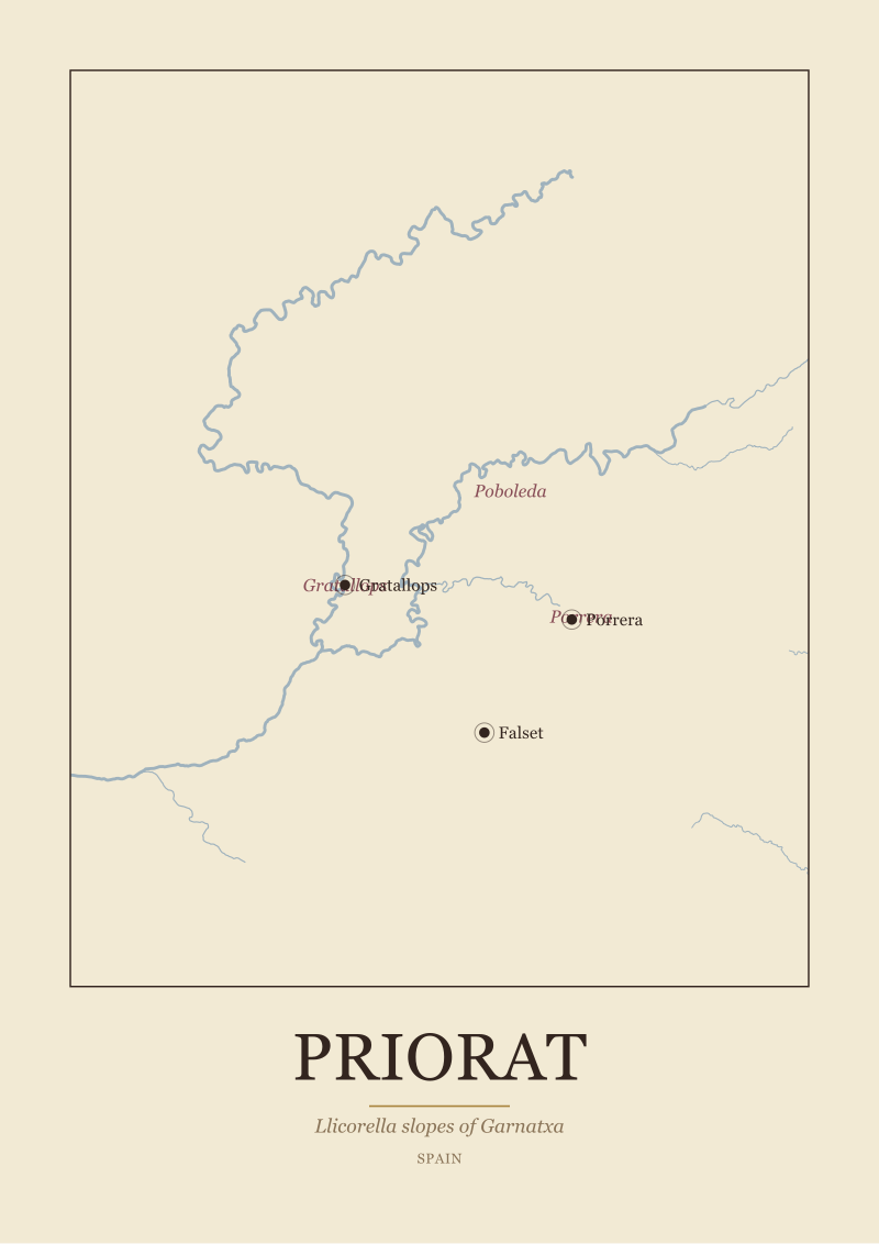
Most print-size guides skip the only question that matters: how far will you stand from the wall. Priorat is a small region drawn on a narrow river — the Siurana threading past Gratallops, Porrera and Poboleda — and the map's whole argument, the llicorella slopes ringing Falset, only survives at certain sizes. Print it too small and the sub-zones vanish into a smudge. Print it too large and the frame fights the room. This guide is a flowchart in prose: three questions about your wall, your distance, and what you want to read from across the room. Answer them and the size chooses itself.
Question 1: How Wide Is the Wall You Are Actually Framing?
Before anything else, measure. Not the room, not the sofa — the wall. Specifically, the horizontal run of uninterrupted plaster or paint where the frame will hang, from one visual break to the next. A visual break is a door frame, a window edge, a bookshelf, a light switch, the corner where two walls meet. That distance is the number we work from. Priorat is drawn tall and narrow when we render it — the Siurana runs roughly north-to-south, and the map's natural orientation is portrait — but the frame around it still needs breathing room on either side of its width.
The rule the studio uses is straightforward: a framed print should occupy between 50% and 75% of the usable wall width. Under 50% and the frame looks stranded; over 75% and it crowds the boundaries and starts to feel like signage rather than an image. Take that percentage of your wall width, then subtract the frame moulding (add roughly 4–6 cm on each side for a standard wooden frame, more for a wide gallery frame). What remains is the paper width your print should sit inside.
If Yes: Your Wall Is Wider Than 180 cm
This is the sofa wall, the dining-room wall, the wall behind the console table in a hallway that opens to a room. You have room for a large-format print — meaning A1 (59.4 × 84.1 cm) at the smaller end, or 70 × 100 cm at the more assertive end. At these dimensions the map is not decoration; it is the object the room is arranged around. Priorat's sub-zones — Gratallops in the west, Porrera to the east, Poboleda higher up the valley — appear as labelled towns rather than dots. Falset, the administrative anchor at the southern edge, reads as a proper settlement rather than a pin.
The temptation on a wide wall is to go bigger still. Resist it once you cross 100 cm on the long edge. Priorat is a compact region — the whole DOQ covers a fraction of the surrounding Tarragona province — and rendered too large, the empty terrain around the Siurana starts to feel like padding. The llicorella slopes lose density. Better to size for the region, then leave generous wall around the frame.
If No: Your Wall Is Between 90 cm and 180 cm
This is most walls in most homes. Bedrooms, studies, the short wall opposite a kitchen island, the alcove beside a fireplace. Here, A2 (42 × 59.4 cm) is the workhorse size. It holds the whole region cleanly, keeps the anchor towns legible, and frames within the 50–75% band on walls up to around 130 cm wide. For walls closer to 180 cm, step up to A1 — but only if the room's other objects can hold the weight (a low sofa, a wide desk, a substantial bed frame). A large frame above a small piece of furniture looks like a bad wig.
Under 90 cm of wall — a narrow corridor, the gap between two doors, a small toilet — you are in A3 territory (29.7 × 42 cm) or smaller. This is a different piece: a diagram, a study, a fragment. Priorat still reads, but as an object of quiet reference rather than a room's centrepiece.
Question 2: How Far Away Will You Usually Stand?
Print size guides written for photography use a formula: viewing distance should be roughly 1.5 times the diagonal of the print. That works for a single-image photograph where the whole frame is one gesture. It does not work for maps. A map is read at two distances — from across the room, where you take in the shape of the region, and from close up, where you read the town names, the river's bends, the sub-zone boundaries. The right size for a Priorat print is the size where both readings work.
Measure the distance from the wall to where you will most often be. Not the maximum distance in the room — the habitual one. The sofa cushion, the desk chair, the side of the bed you sleep on, the spot at the kitchen counter where you make coffee. That is your viewing distance.
If Yes: You Will Usually Stand or Sit More Than 2.5 Metres Away
The living-room case. From this distance, small type is unreadable regardless of paper size — the eye simply cannot resolve 8-point letters at 3 metres. What matters at range is the shape of the region and the position of the river. The Siurana's course from the Serra de Montsant down through the DOQ, the roughly triangular footprint of the appellation, the cluster of dark slopes around Gratallops — these are the shapes that carry across the room.
For this distance, size up rather than down. A2 is the minimum; A1 or 70 × 100 cm is the target. The extra size does not exist to make small text bigger — it exists to make the shape of Priorat legible as an object in the room. When you cross close for the second reading, the town names and the sub-zone labels are all there, waiting. But the frame's job at 3 metres is silhouette, not typography.
If No: You Will Sit or Stand Within 2 Metres
The bedroom, the study, the kitchen wall you pass at arm's length, the space behind a desk. Here you can size down without losing anything. A2 is generous; A3 works cleanly. At 1.5 metres, the eye reads Gratallops, Porrera and Poboleda without squinting even on A3, and the Siurana's bends are close enough to trace with a finger.
The trap at close viewing distance is going too large. An A1 print at arm's length forces the viewer to scan across the paper rather than see it as one image. The frame stops being a map and starts being a wall — the eye never rests on the whole. If your habitual distance is under 2 metres, treat A2 as the ceiling unless the wall genuinely demands more.
 Priorat
The print from this article · from €29.95
View the print →
Priorat
The print from this article · from €29.95
View the print →
Question 3: Do You Want to Read Gratallops, or See the Siurana as a Shape?
This is the question most guides never ask, and it is the one that separates a map that hangs on your wall from a map that gets looked at. Every size decision so far assumes you want both readings — the shape from a distance, the detail up close. But some rooms and some viewers want one or the other. A restaurant hangs a map for atmosphere; the shape matters, the labels are texture. A wine collector's study hangs a map for reference; the labels are the point, the shape is context.
Decide honestly which reading matters more to you in this specific room. Then let that answer weight the size upward or downward from what Questions 1 and 2 suggested.
If Yes: You Want to Read the Region — Sub-Zones, Anchor Towns, Villages
Then size for legibility, not for wall presence. On the studio's Priorat plate, the sub-zone labels — Gratallops, Porrera, Poboleda — are set at a size that resolves cleanly at A2 and above. At A3, they read but they lean toward small; the eye does the work. Below A3, they become texture rather than text. If your priority is reading the region, treat A2 as the floor, and step up to A1 if the wall and viewing distance from Questions 1 and 2 allow.
The Siurana's course, the ring of llicorella slopes around Falset, the position of the Serra de Montsant to the north — these all reward the larger size too. Not because the shapes need it, but because the relationship between the shape and the labels is what makes a wine map a map rather than a graphic. That relationship needs room.
If No: You Want the Siurana and the Slopes as a Shape
Then you have freedom to go smaller, or to hang the print in a room where distance would otherwise force a compromise. A3 becomes a real option. The map still works — Priorat's silhouette, the river's line, the general density of the llicorella zone all carry — but the labels move into supporting role rather than lead. This is the right choice for a hallway you pass through rather than sit in, for a small bathroom where the map is a moment rather than a subject, for a bedroom wall where you want atmosphere rather than reference.
There is nothing lesser about this reading. Priorat as a shape is a strong image: a compact region, a bending river, a topography that looks steep even in outline. Sized for shape rather than label, the map earns its place without asking the viewer to read it.
If You Answered Everything: The Size Map
Here is the answer key. Q1 asks whether your wall is wide (>180 cm) or standard (90–180 cm). Q2 asks whether your viewing distance is far (>2.5 m) or near (<2 m). Q3 asks whether your priority is labels (read the region) or shape (see the region). Eight combinations, one recommendation each.
| Q1: Wall | Q2: Distance | Q3: Priority | Recommendation |
|---|---|---|---|
| Wide (>180 cm) | Far (>2.5 m) | Labels | 70 × 100 cm — shape reads at range, labels reward the walk-up. |
| Wide (>180 cm) | Far (>2.5 m) | Shape | A1 (59.4 × 84.1 cm) — enough silhouette without over-scaling a small region. |
| Wide (>180 cm) | Near (<2 m) | Labels | A1 (59.4 × 84.1 cm) — labels resolve cleanly, frame fills the wall band. |
| Wide (>180 cm) | Near (<2 m) | Shape | A1 (59.4 × 84.1 cm) — go no larger; the region does not need it. |
| Standard (90–180 cm) | Far (>2.5 m) | Labels | A1 (59.4 × 84.1 cm) — the label-priority forces up from A2. |
| Standard (90–180 cm) | Far (>2.5 m) | Shape | A2 (42 × 59.4 cm) — shape carries at distance, wall stays uncrowded. |
| Standard (90–180 cm) | Near (<2 m) | Labels | A2 (42 × 59.4 cm) — the canonical answer for most rooms in most homes. |
| Standard (90–180 cm) | Near (<2 m) | Shape | A3 (29.7 × 42 cm) — small, quiet, right for hallways and short walls. |
A note on the table. The A1 answer appears four times because it is the size Priorat is drawn to argue best — large enough that Gratallops, Porrera and Poboleda are labelled towns rather than tags, small enough that the region does not float in unused white space. If you are between combinations, A1 is the default that will almost always work. A2 is the default for smaller rooms. A3 is a deliberate choice for a specific kind of quiet.
The 70 × 100 cm size is deliberately narrow in its recommendation. It is a large piece — appropriate for a wide wall viewed from across a room, where the extra centimetres translate into silhouette weight. In a smaller room, or at closer distances, it stops being a map and becomes a mural. Priorat is a small region on a real map; treated too large, that reality gets lost.
We publish these sizes because they are the ones that hold the region's argument. The full range, printed on the studio's own stock, is at see the Priorat print — including the Priorat plate that renders the Siurana from the Serra de Montsant down through the DOQ, with the llicorella zone shaded and the anchor towns set at the sizes discussed above.
This guide did not cover three things worth naming. It did not cover frame choice — wood versus aluminium, mount versus float, glass versus acrylic — because that is a taste question shaped by the rest of the room, not a geography question. It did not cover lighting, which changes what a map reveals more than any size decision (a print under warm downlight reads differently to the same print in daylight from a window). And it did not cover hanging height, which has its own rules the studio may write about separately. Each of those decisions comes after the size is right. Get the size right first.
FAQ
What is the most common Priorat print size people actually order?
A2 (42 × 59.4 cm) is the studio's most-shipped Priorat size. It fits the wall widths most people are framing (roughly 100–150 cm of usable wall), works at the viewing distances typical of bedrooms and studies, and holds the sub-zone labels cleanly. It is not the largest option and not the most dramatic — it is the one that quietly works in the widest range of rooms, which is usually what people are actually looking for.
Does the Priorat print work in portrait or landscape orientation?
Portrait. The Siurana runs roughly north-to-south through the DOQ, and Priorat's footprint is taller than it is wide, so a portrait frame follows the region's natural shape. A landscape crop would either cut off the Serra de Montsant to the north or leave large empty margins east and west. The studio publishes Priorat in portrait for this reason — the geography chose the orientation, not the layout.
Can I hang a Priorat print above a sofa without it looking too small?
Yes, if you size it correctly. A standard sofa is 180–220 cm wide, which means the frame should occupy 90–165 cm horizontally to hit the 50–75% band. That points to A1 (59.4 × 84.1 cm) at minimum, and 70 × 100 cm if the wall above the sofa is generous. Anything A2 or smaller above a full-size sofa reads as under-scaled — the sofa wins the visual argument and the map becomes an accessory.
How far from the wall should I stand to read the sub-zone names?
Roughly one metre or closer for A2, up to about 1.5 metres for A1, and up to two metres for 70 × 100 cm. These are not absolute — eyesight varies — but they are the distances at which the town-tier labels (Gratallops, Porrera, Poboleda, Falset) resolve without squinting on the studio's typography. Beyond those distances the labels remain present but become texture; the shape of the region takes over as the primary reading.
Is A3 really large enough for a Priorat map, or is it a compromise?
A3 (29.7 × 42 cm) is a deliberate size, not a compromise, provided you know what you are choosing. At A3 the region's shape, the Siurana's line, and the llicorella zone all read clearly. The town labels are legible up close but become quiet from across the room. It is the right size for hallways, small studies, and rooms where the map is atmosphere rather than reference. It is the wrong size if you want to read the region from the sofa.
What if my wall width falls exactly between two size recommendations?
Go smaller and leave more wall around the frame, rather than larger and crowding the boundaries. A frame with generous wall around it reads as intentional; a frame that fights the edges reads as forced. The 50–75% band is a guideline, and the lower end of it (closer to 50%) almost always looks more considered than the upper end. When in doubt, treat the wall as a mount and let the print sit inside it with room to breathe.
Does the paper stock or finish change which size works?
Marginally. Matte paper reads slightly larger than glossy at the same dimensions because the eye is not distracted by reflections, so a matte A2 can hold a wall where a glossy A2 might feel understated. Heavier stocks (250 gsm and above) also carry more visual weight in the frame. These are second-order effects — the size decisions in this guide hold across finishes. The primary variables remain wall width, viewing distance, and whether you want labels or shape.
New regions and 10% off your first print.
One email now with your code. No noise after.