Every framing guide for wine region prints tells you the same thing: frames elevate, unframed feels casual. Every wine-region print itself argues the opposite: the shape of what you are hanging decides the answer, not the finish you put around it. Both statements are correct, and the reason nobody reconciles them is that most of the advice online is written by people who have never drawn a river. The Mosel is our test case. It switches back through slate cliffs from Trier past Bernkastel-Kues to Piesport, and that geometry is why the standard framing recommendation collapses the moment you hold the print up to the wall.
The Framing Advice You'll Find Online Is Written by People Who Have Never Drawn a River
Open the first three articles that Google returns for this question and read them in a row. They will tell you the same thing in slightly different words. Framed prints look more considered. Unframed prints feel more relaxed. A mat around the image adds gravitas. A thick oak moulding says library. A thin black metal moulding says gallery. Somewhere in the middle of the article there is a paragraph that begins, "Ultimately, it comes down to personal preference."
That paragraph is where the advice quietly gives up.
The reason it gives up is that the framework it started with is the wrong one. Those articles are written by generalist interior-design copywriters working from a checklist, and the checklist was built for rectangles of colour. A landscape photograph is a rectangle. A portrait is a rectangle. A framed jersey is a rectangle. The frame around each of those things does the same job: it draws a hard line where the composition ends and the wall begins, so the eye knows where to stop. When the interior article says "frames elevate," what it actually means is "frames tell the eye where the image stops," and that job is genuinely useful when the image would otherwise dissolve into the paint behind it.
A wine region map is not a rectangle of colour. It is a line drawing of a place with real geography and a lot of white space around the geography. The Mosel print, in particular, is almost entirely negative space, because the river is a thin serpent moving diagonally through paper that mostly represents the plateaus and slate ridges the vineyards climb. The image already tells the eye where to stop, because the eye stops at the last bend of the river. Adding a frame doesn't elevate that. It competes with it.
We are not against frames. We frame plenty of things. We are against advice that treats a river as if it were a Rothko.
The Mosel Is Not a Rectangle, and That Changes What a Frame Does to It
If you sketch the Mosel on a napkin, you do not draw a straight line. You draw a series of loops. From Trier, where the Romans set the earliest vineyards on the south-facing bends, the river feints south, then swings hard north, then south again, then north again, all the way past Bernkastel-Kues and on to Piesport, where the great amphitheatre of vines curls around one of the deepest bends of them all. It is the shape of a river that has spent millions of years cutting into slate that will not let it move sideways easily.
Cartographers have a word for what this shape does to a page: it is diagonal-dominant. Nothing about it aligns with the edges of the paper. The river runs at whatever angle the slate allowed, the anchor towns fall wherever the river let them, and the sub-regions of the Mittelmosel, the Saar, and the Ruwer meet at the confluences that a fault line dictated long before anyone thought about hanging any of this on a wall.
A rectangular frame is, definitionally, an argument for the rectangle. It draws four hard right angles around the image and says: this is the boundary. When the thing inside the boundary is itself rectangular — a landscape photograph, a colour field — the frame reinforces the composition and the eye reads the picture as complete. When the thing inside is a diagonal river with generous white space on either side, the frame does something different. It forces the diagonal into a container the diagonal did not ask for. The eye now sees two things at once: the shape of the Mosel and the shape of the frame, and it has to negotiate which of them is the subject.
Sometimes that negotiation works. A narrow, dark moulding — matte black metal, roughly a centimetre wide — reads almost like a passe-partout and lets the diagonal breathe. A thick wooden moulding in oak or walnut, the kind the framing articles keep recommending, does the opposite. It puts a heavy horizontal-vertical grid around a shape that is entirely about resisting horizontal and vertical, and the print starts to feel like a diploma of the Mosel rather than a portrait of it.
This is not personal preference. This is what happens when you put a diagonal composition into an orthogonal container. Every print of a switchbacking river has the same problem. The Mosel just has it more obviously than most, because its bends are the tightest in the German wine map.
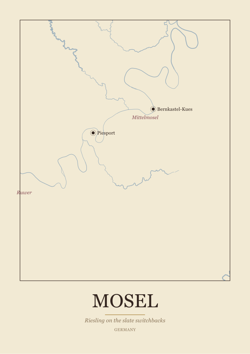 Mosel
The print from this article · from €29.95
View the print →
Mosel
The print from this article · from €29.95
View the print →
Unframed Prints Have a Register Framed Ones Cannot Reach
There is a second reason people frame things, which the interior articles rarely name, and which matters more than the elevation argument. A frame turns an image into a possession. It says: this belongs to someone who bought it, matted it, chose the moulding, hung it centred. Framing is an act of curation, and the frame is the receipt.
Unframed prints refuse that. They register as working documents. A pinned map in an architect's studio, a hydrological survey tacked to a hallway wall, a botanical plate held up by two washi-tape strips at the corners — these read as something in use, not something concluded. The paper edge is visible. The paper's own texture — the slight wave that a heavy cotton stock takes on when it dries, the deckle if the studio chose one — becomes part of what you are looking at.
For a map drawn from Natural Earth data, this register is the honest one. The underlying source is a public-domain scientific dataset used by cartographers, journalists, and government agencies to draw rivers and coastlines accurately. A print that acknowledges its lineage — that reads as a plate from a survey rather than an artwork made to fit above a mantelpiece — sits more naturally in the unframed register. The frame, in this case, is not what makes the image serious. What makes the image serious is that the river is drawn where the river actually is.
We say this having framed Mosel prints ourselves. There is nothing wrong with framing one. What we are describing is a register the framed version cannot reach: the register of a working geography, still in use, still being read. If that is what you want in the room, a frame will politely take it away from you and give you a piece of decoration back.
Where the Print Hangs Decides More Than the Finish Does
Ask any framer who has been doing this for twenty years and they will tell you that half the framing decisions they see are wrong not because the frame was wrong but because the wall was wrong. A print's finish is a conversation with the surface behind it, and the surface behind it is almost never white gallery drywall.
The Mosel print, specifically, has three walls it tends to end up on. One is the kitchen or dining wall, near where wine actually gets opened. Two is a hallway or stairwell, where narrow verticals or long horizontals fit and where the eye passes rather than lingers. Three is the study or living room, where the image is meant to be looked at for a long time.
The kitchen wall changes constantly. It has steam from cooking, splashes from opening bottles, the shifting light of a room in use. Framed prints on kitchen walls trap condensation between glass and paper, and the mat starts to buckle within two years. An unframed print on a kitchen wall — hung with archival magnets on a metal strip, or pinned with brass tacks straight into plaster — ages honestly with the room. When it fades or warps you replace it, which is what a working document is supposed to allow.
The hallway is where framing wins. A hallway is a passage, not a room, and the frame does the job of announcing that you have arrived at something worth stopping for. A slim frame around a long horizontal Mosel print — reading east to west along the river's actual axis — reads as a considered piece the same way a framed photograph does.
The living-room wall is the one where the two options genuinely compete, and where the honest answer is the one nobody wants: it depends on the other things already on the wall. If the room is full of framed art, another frame joins the chorus. If the room is spare — a shelf, a lamp, one large plant — an unframed print on cotton stock, hung with two clips, will hold its own better than a frame ever would, because it is the only thing in the room that is not trying to be furniture.
The Honest Answer Depends on What You Want the River to Do in the Room
We began by saying the framed-versus-unframed question is asked backwards. Here is the version of the question that actually resolves.
Do you want the Mosel to be a subject the room contemplates, or do you want it to be a texture the room lives with? A framed print is a subject. It sits behind glass, it has a boundary, it invites the eye to stop and consider. That is a real thing to want. Some rooms need a subject on the wall — a still centre the rest of the space arranges itself around. In those rooms a Mosel print with a narrow dark frame, matted generously, hung at eye level, is doing exactly what a frame is for.
An unframed print is a texture. It reads as paper first and image second, which sounds like a demotion and is actually the opposite. It puts the river in the same category as the wooden shelf, the linen curtain, the ceramic bowl — things that are what they are, not representations of what they are. In that register the Mosel stops being a wine-country decoration and becomes a piece of geography you happen to live with. Which, if you have ever stood on the ridge above Bernkastel and watched the river bend below you, is probably closer to what you were reaching for when you searched for a Mosel print in the first place.
For anyone weighing this choice on the studio's Mosel print, the practical version of the same advice is short. If the room already has framed art and the wall is small, frame it, narrow and dark. If the room is spare and the wall is large, leave it unframed on heavy cotton stock and hang it with clips or magnets. If the room is a kitchen, always unframed. If the room is a hallway, almost always framed.
This started as an argument about frames and turned into an argument about what a wine region print is actually for. That is the essay we meant to write, and we did not know it until we had written the first three paragraphs of the essay we thought we were writing. The Mosel bends nine times between Trier and Koblenz, and this piece bent twice getting to the same place: geography decides more than finish does, and the honest answer is the one that asks what the river is doing in the room, not what the moulding costs.
FAQ
Does the framed-versus-unframed answer change for other wine regions?
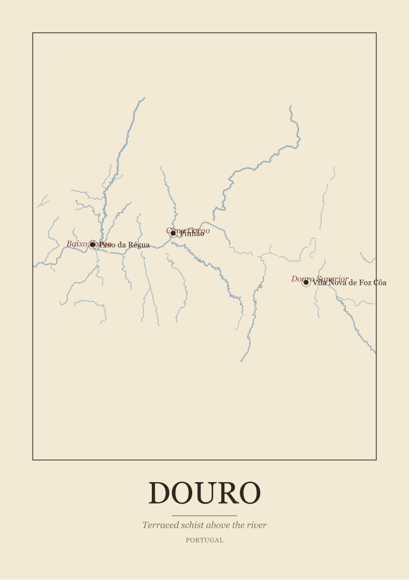
Yes, and this is the part most framing guides miss. Bordeaux is dominated by a wide estuary and two roughly parallel rivers — its geometry sits more comfortably inside a rectangle than the Mosel's does, so framing collides less with the composition. The Douro's terraced staircase and the Mosel's switchbacks share the same problem: they are diagonal-dominant compositions that fight rectangular frames. Regions built around a single valley respond differently to framing than regions built around a coastline or a plain. Ask the shape first.
What size Mosel print reads best unframed?
The unframed register rewards larger paper, because paper edge becomes part of the composition and needs enough surface to register as intentional. Below roughly A3 the print reads as a study or a note, which is fine for a kitchen or a corkboard. At A2 and above, an unframed print on heavy cotton stock starts to hold a wall on its own, and the river's bends have room to breathe. Smaller than A4, we would frame it — the paper edge disappears at that scale.
Will an unframed print fade faster than a framed one?
Under UV-filtering glass, framed prints have a real longevity advantage — often decades before visible fading on pigment inks. Unframed prints on archival cotton stock, hung out of direct sunlight, will still hold their colour for many years but will show environmental wear sooner: humidity, kitchen steam, occasional handling. The choice is honest wear versus preserved artifact. Neither is wrong; they answer different questions about what you want the print to be over time.
What frame style hurts a Mosel print the least, if we have to frame it?
A narrow matte-black or dark walnut moulding, roughly one centimetre wide, with a generous white mat around the image. The narrow moulding minimises the visual argument between the diagonal river and the rectangular frame; the white mat gives the composition breathing room so the switchbacks do not feel crammed against the boundary. Thick oak mouldings and heavy gilt frames are the two finishes that consistently fight the geometry hardest.
How should we hang an unframed wine map without damaging it?
Two archival methods work well. Small rare-earth magnets on a discreet steel strip fixed to the wall — the print sits behind the magnets with no puncture at all. Or two brass bulldog clips at the top corners, hung from small nails or tacks. Both let the paper move slightly with humidity, which is what unframed prints are designed to do. Avoid tape directly on the print face and avoid dry mounting, which permanently bonds paper to backing and eliminates the register that made unframed worth doing in the first place.
Does the paper stock matter as much as the framing choice?
More than the framing choice, in our experience. A wine region map printed on thin poster stock will look casual whether framed or not — the paper telegraphs disposability. The same map printed on 300-gram cotton, mould-made, with a subtle texture, reads as considered even pinned to a plaster wall with tacks. If the budget forces a trade-off, spend on paper before you spend on the frame. The frame protects the print; the paper decides whether the print was worth protecting.
Where in a room does a Mosel print sit best?
Somewhere the river's east-to-west axis can hang horizontally without being cropped by furniture. Above a sideboard, a low bookshelf, or a dining bench works well because those pieces are horizontal themselves and echo the print's dominant direction. Above a sofa is the standard answer and it is fine but slightly obvious. Avoid hanging a strongly horizontal river print above a strongly vertical piece of furniture — a tall narrow bookcase, for instance — because the two shapes will argue rather than compose.
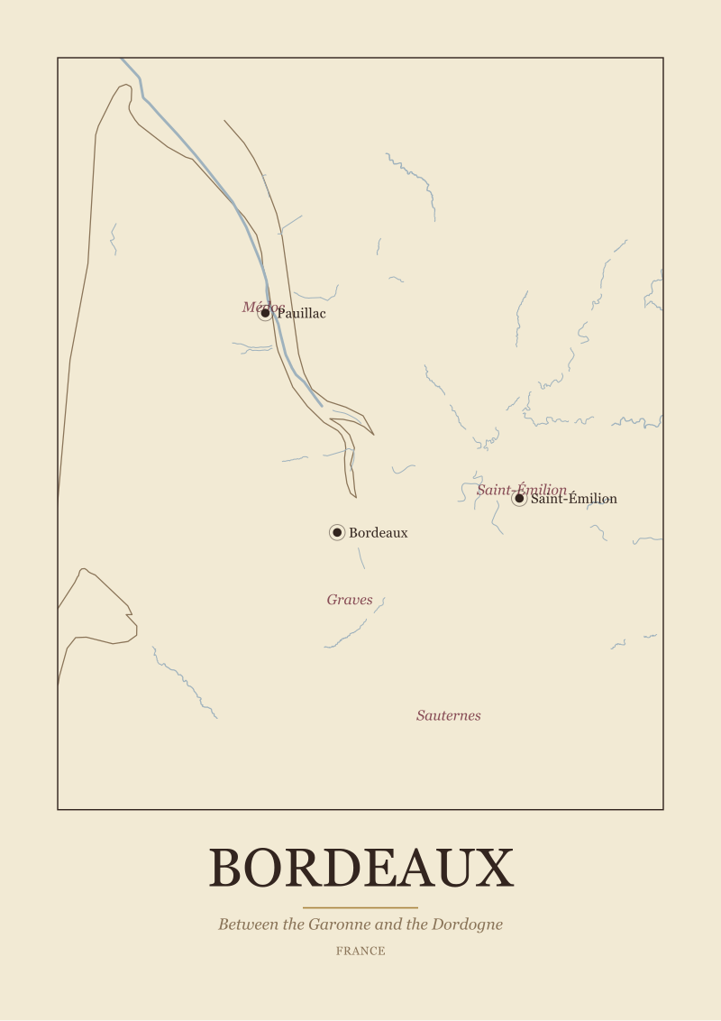 Bordeaux
The print from this article · from €29.95
View the print →
Bordeaux
The print from this article · from €29.95
View the print →
New regions and 10% off your first print.
One email now with your code. No noise after.