We spent a week last spring pulling every wine region map we could find off print-on-demand marketplaces and gallery walls — 34 designs in total, spanning Bordeaux, Burgundy, Champagne and Alentejo — and grading each against three geographic facts drawn from the same public dataset the cartography world treats as ground truth: Natural Earth's 1:10m rivers and coastline. The results were not encouraging. Roughly a third omitted the region's defining river entirely. A quarter drew appellation borders as smooth ovals where the real boundary follows a slope, a stream, or a commune line older than the phylloxera crisis. This piece is the checklist that came out of that week.
The honest answer to "what should I look for" is that it depends on who the map is for, what wall it will hang on, and whether the buyer has ever stood in the region. Rather than pretend one checklist fits every case, we will walk through three composite buyers — none of them real people, all of them stitched together from the questions our studio inbox receives most often — and show which geographic details actually matter in each situation. Then we will pull out the pattern the three share.
Scenario 1: The Bordeaux Gift-Buyer Who Has Never Been
Imagine a buyer we will call the gift-giver. She lives in a city far from any vineyard and is shopping for a friend's fortieth birthday. The friend loves Bordeaux, has been to Saint-Émilion once, and mentions Pauillac at dinner parties. The gift-giver herself has never been to Bordeaux and cannot pick the Médoc out of a lineup. She wants a map that looks handsome above a sideboard and does not embarrass her by getting something wrong that her friend will notice on Christmas morning.
For this buyer, the trap is a map that shows Bordeaux as a single blob labelled *Bordeaux* with a wine glass icon in the middle. Bordeaux is not a blob. Bordeaux is the story of two rivers, the Garonne and the Dordogne, converging into the Gironde estuary, and the wine region is defined almost entirely by which side of that water system a vineyard sits on. The Médoc runs north along the left bank. Saint-Émilion sits on the right bank. Graves and Sauternes lie south of the city along the Garonne. A map that omits the rivers omits the entire logic of the appellation.
So the first thing the gift-giver should look for is whether the Garonne is drawn — and whether it is drawn accurately, meandering rather than ruler-straight. The second thing is whether the four sub-zones her friend would recognise — Médoc, Saint-Émilion, Graves, Sauternes — appear as labelled areas rather than as generic dots. The third thing is whether the anchor towns are named at the right positions: Bordeaux itself on the Garonne, Saint-Émilion east of the confluence, Pauillac up the Médoc peninsula.
If the map passes those three tests, it is going to survive scrutiny from the friend who has been there. If it fails one, the friend will notice on the second glass of wine at dinner. Our gift-giver does not need to understand terroir. She needs a map that would not embarrass a cartographer, because her friend is closer to a cartographer than she realises whenever the subject of Bordeaux comes up. The framed version should be modest in scale — big enough to read the sub-zone labels from across a room, small enough that a sideboard can carry it without turning the wall into a lecture.
Scenario 2: The Burgundy Returnee Furnishing a Dining Room
Picture a second buyer: a couple who spent a week in Beaune two summers ago and are now furnishing the dining room of a house they finally own. They walked the Côte d'Or. They remember the specific smell of the road between Nuits-Saint-Georges and Vosne. They want a map above the table where they will host the friends who were on that trip with them, and the map has to survive the scrutiny of people who have stood on the exact slope it depicts.
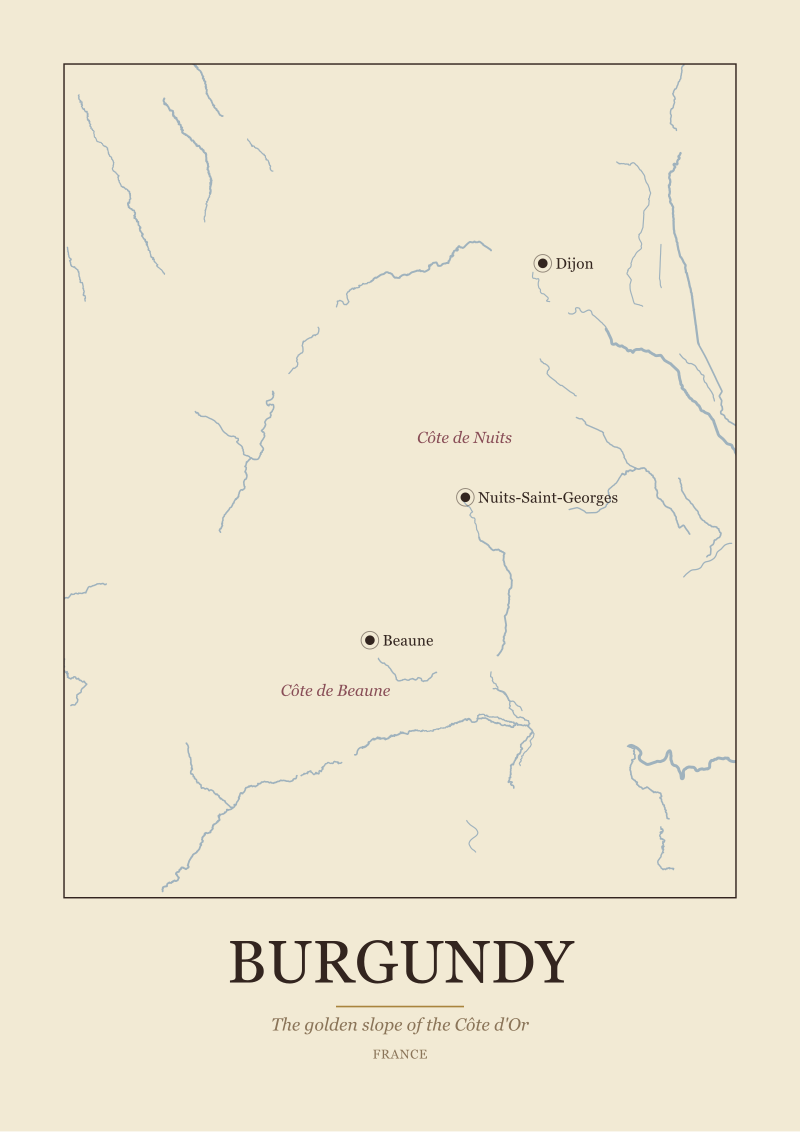
For this couple, the stakes are higher and narrower. Nobody at that dinner table will care whether the Saône is drawn as a hairline or a ribbon — but everyone will notice if the Côte de Nuits and Côte de Beaune are drawn as a single undifferentiated strip. Burgundy's famous golden slope is exactly that: a slope, running roughly north-south, with the Côte de Nuits at its northern half around Nuits-Saint-Georges and the Côte de Beaune at its southern half around Beaune itself. The split is the map. If the map does not show the split, it is not a Burgundy map. It is a Burgundy-shaped decoration.
The Saône matters here too, though less obviously than in Bordeaux. The river is not the vineyard; the vineyard is on the hillside above the valley the river cut. A map that shows the Saône as a defining feature is telling the couple where the slope sits — east of the water, facing the morning sun. A map that leaves the river out but keeps the hillside implicit through elevation shading is defensible; a map that leaves both out has drawn Burgundy as an abstraction.
For a dining-room piece, we would also look for Dijon in the north as an anchor. Dijon is not the wine capital — Beaune is — but Dijon defines the northern frame of the Côte, and its absence tells you the cartographer either did not know the geography or trimmed the frame to fit a poster template. The couple should also expect Nuits-Saint-Georges to be labelled by name; if it is not, half the reason they are buying the map is missing from it.
The dining-room scale is generous. This is a piece meant to be looked at, discussed, argued over across a long lunch. It should be readable from the far end of the table. Framed simply — the map is doing enough work already without decorative borders competing for attention.
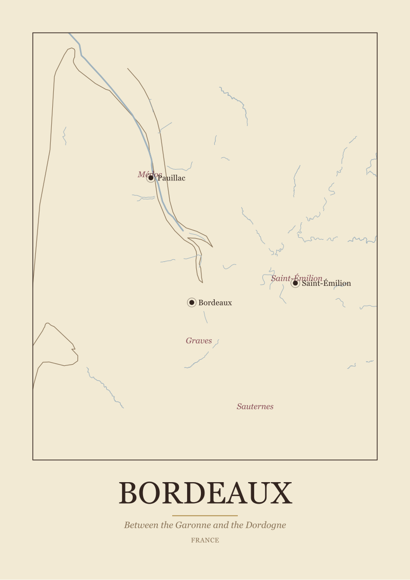 Bordeaux
The print from this article · from €29.95
View the print →
Bordeaux
The print from this article · from €29.95
View the print →
Scenario 3: The Alentejo Sceptic Working from a Home Office
Let us say a third buyer works from home in a converted spare bedroom. She lived in Portugal for two years, spent long weekends in Évora, drank Alentejo wine on terraces in Borba, and has come home to a country where the wine shop labels her old favourite region as "Portuguese red" with no further detail. She is sceptical of wine maps generally because most of the ones she has seen treat Portugal as an afterthought stapled to the western edge of a Spain-shaped page. She wants a map that treats Alentejo as its own subject.
Alentejo is a difficult region to draw well because it is defined less by a dramatic river valley than by warm plains and the towns embedded in them. The Guadiana is the main river, running roughly north-south through the eastern half of the region — but a buyer who knows Alentejo knows the wine is not clustered along the water the way Bordeaux clusters along its rivers. Alentejo's wine towns — Borba, Redondo, Reguengos — sit inland, in a triangle east of Évora. A good Alentejo map draws the Guadiana because leaving it out is dishonest to the geography, but it also draws Évora at its actual position and labels the three sub-zones as distinct places, not as a single generic *Alentejo* wash.
For the sceptic, the tell is whether the map has been made by someone who knows the region or by someone who has downloaded a Portugal outline and dropped a wine icon on it. If Reguengos does not appear on the map, the cartographer does not know Alentejo. If the Spanish border to the east is drawn as a soft edge rather than a hard political line, the cartographer does not understand that Alentejo's eastern character comes partly from being a frontier region — Spain is a fact, not a suggestion. If the sub-zones are drawn as neat circles rather than as approximations of the actual growing areas around Borba, Redondo and Reguengos, the map is decorative rather than cartographic.
A home office is a private wall. The map does not have to justify itself to dinner guests. But it does have to survive daily glances from someone who knows the territory. In practical terms, a smaller scale works well here — a piece the buyer looks at while thinking about something else, that rewards close reading during a coffee break. Framing should be quiet. The map is a reference document as much as a decoration.
What All Three Share: The Three Questions the River Answers First
Across the three composite buyers, one pattern kept appearing in our week of grading maps: the river is the diagnostic. If a cartographer drew the river well, they almost always got the towns right, and if they got the towns right, they almost always understood the sub-zones. If they omitted or fudged the river, everything downstream broke.
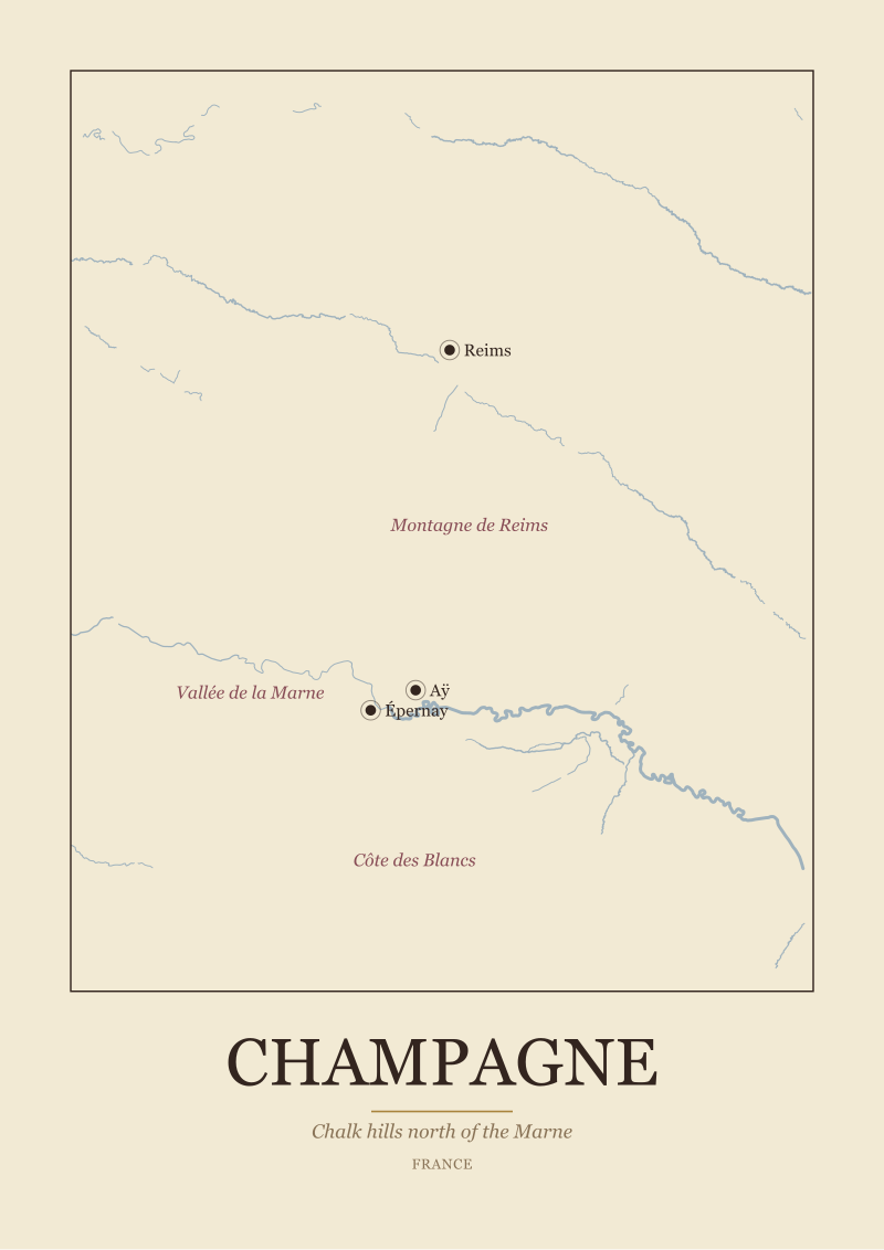
There is a simple reason for this. Every great European wine region is a geographic accident of a specific waterway. Bordeaux exists because the Garonne and the Dordogne created a gravel-and-clay estuary. Burgundy exists because the Saône valley cut a limestone slope with the correct east-facing angle. Champagne exists because the Marne cuts through chalk hills where grapes barely ripen. Alentejo is the exception that proves the rule — the Guadiana matters less to the vineyard than the river does in the French regions, but a map that omits it is still lying about the shape of the country the wine grows in.
So the three questions we ask before framing any wine region map are these. First: does the map show the region's defining river, drawn as the river actually flows rather than as a stylised straight line? Second: are the anchor towns named at their real positions, so a reader who knows the region can navigate the map without stumbling? Third: are the sub-zones drawn where the land actually places them, or have they been smoothed into ovals for graphic convenience?
A map that passes all three is a map that will hang honestly on any wall, in front of any audience.
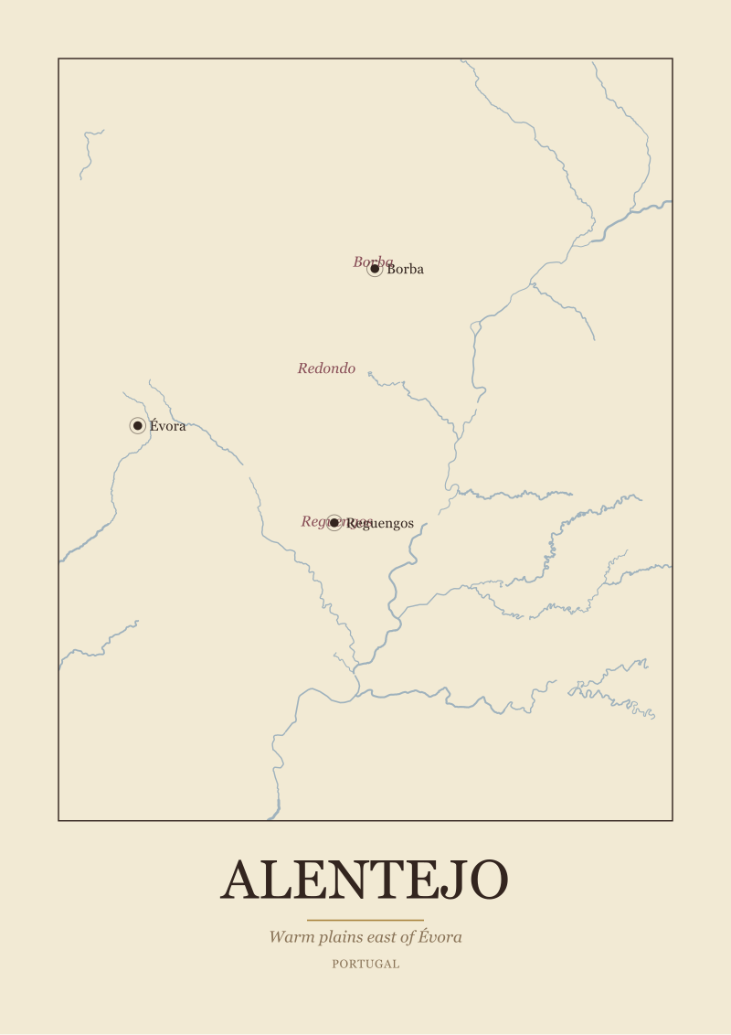 Alentejo
The print from this article · from €29.95
View the print →
Alentejo
The print from this article · from €29.95
View the print →
Which Scenario Is You: Matching the Map to the Room and the Reason
If you are buying for someone who knows the region better than you do, you are the gift-giver. Prioritise the anchor towns and the sub-zone labels. Your buyer's credibility is protected by names being in the right places.
If you are buying for a room where the map will be discussed by people who have been to the region, you are the returnee. Prioritise the internal geography — the slope, the split between northern and southern halves, the river that runs alongside rather than through the vineyard. Your buyer's memory of the trip will be checked against the paper.
If you are buying for yourself, for a private wall, and you know the region, you are the sceptic. Prioritise the fidelity of the boundary and the presence of the smaller towns most maps skip. Your buyer is you, and you are the hardest critic.
If none of the three sounds like you, the honest answer is to spend an afternoon looking at the region on a satellite map first — then come back to the printed version knowing what should be on it. Our studio's own maps, if you want to see how we handle these three questions, are at /shop/, drawn from the same public dataset we grade others against.
FAQ
Why is the river the first thing to check on a wine region map?
Because every great European wine region is a geographic accident of a specific waterway, and a cartographer who draws the river well has almost always understood the rest of the region. In our week of grading 34 maps, the ones that omitted the river also mis-placed towns, smoothed sub-zone borders into ovals, and lost the internal logic of the appellation. The river is the diagnostic — get it right and the rest tends to follow.
Do the sub-zones on a Bordeaux map really need to be labelled separately?
Yes, if the map is going anywhere near someone who knows Bordeaux. The region is defined by four sub-zones that anyone who drinks Bordeaux will recognise: Médoc on the left bank, Saint-Émilion on the right, Graves and Sauternes south along the Garonne. A map that shows Bordeaux as a single labelled area treats the region as a marketing concept rather than as geography, and readers who have visited will notice within seconds.
What makes a Burgundy map credible to someone who has walked the Côte d'Or?
The split between the Côte de Nuits in the north and the Côte de Beaune in the south has to be visible. Burgundy's golden slope is exactly that — a slope, running roughly north-south, with different character at each end. A map that draws the Côte as a single undifferentiated strip has drawn Burgundy as decoration. Dijon should anchor the northern frame; Beaune and Nuits-Saint-Georges should be named at their real positions along the slope.
Is it a problem if a wine map leaves out the Saône or the Guadiana?
It depends on the region. For Burgundy, the Saône defines where the slope sits, so leaving it out weakens the map even though the vineyard is on the hillside above rather than in the valley. For Alentejo, the Guadiana matters less to the vineyard directly — the wine towns cluster inland around Évora — but omitting it still misrepresents the country the wine grows in. As a rule, if the river is on the Natural Earth 1:10m dataset, it belongs on a serious map.
How large should a wine region map be for a dining room versus a home office?
A dining-room piece should be readable from the far end of the table, because it will be discussed across long lunches. That usually means a generous scale with anchor towns legible from across the room. A home-office piece can be smaller and quieter — a reference document you glance at during coffee, that rewards close reading rather than announcing itself. In both cases, framing should be modest so the geography does the work.
What does a badly drawn appellation border look like?
It looks like a smooth oval. Real appellation boundaries follow slopes, streams, commune lines and centuries-old administrative edges — none of which produce round shapes. In our week of grading maps, roughly a quarter of the designs had smoothed the borders into ovals for graphic convenience. The reader who has visited the region will read that smoothing as a shortcut, and once one shortcut is visible the rest of the map loses trust.
Should the Spanish border show up on an Alentejo map?
Yes, drawn as a firm political line rather than a soft edge. Alentejo's eastern character comes partly from being a frontier region, and a map that treats the border as a suggestion misrepresents that. The three sub-zones — Borba, Redondo, Reguengos — should also appear as distinct labelled areas east of Évora, not as a single generic wash. If Reguengos is missing, the cartographer did not know the region.
Is there any wine region where the river genuinely does not matter?
Not really, in the European regions we work with. Champagne exists because the Marne cuts through chalk hills where grapes barely ripen. Bordeaux exists because of the Garonne and the Dordogne. Burgundy's Saône defines the slope. Alentejo's Guadiana matters less directly to vineyard placement but still defines the shape of the country. A wine map that leaves the water out is choosing decoration over honesty — and readers who know the region will feel the absence even if they cannot name it.
New regions and 10% off your first print.
One email now with your code. No noise after.