We started drawing a wine map poster of France the way most studios do: appellations first, then rivers as decoration. It did not work. The sheet looked like a legal document. So we inverted the order. We drew the Garonne, the Dordogne, the Marne, the Saône, the coastline, and only then the regions that grew up around them. Bordeaux fell into place between two rivers. Champagne settled on its chalk hills north of the Marne. Burgundy narrowed to a slope. The poster stopped explaining France and started showing it.
That inversion is the whole thesis of this piece. A wine map of France is not a legal document about who is allowed to write what word on which label. It is a map of water, rock, and slope, on which the labels were later drawn. Almost every good decision we made on the sheet came from committing to that order and refusing to reverse it, even when the appellation lines wanted to shout louder than the rivers underneath them.
What follows is how the sheet grew, what it shows, and what we decided it should never show.
A Wine Map of France Is a River Map Before It Is Anything Else
The first honest wine map of France you can draw with a clean conscience is a river map with three names on it. The Garonne is the artery of the southwest, running past the city of Bordeaux and out to the Atlantic. The Marne is the slow river that carves the chalk plateau north-east of Paris, with Reims to the north of it and Épernay directly on its bank. The Saône is the quieter of the three, sliding down the eastern side of the country past Dijon and Beaune, feeding eventually into the Rhône further south. Draw only those three rivers and you have already located, without naming them, the three most famous wine regions in France.
That is not a coincidence, and it is not a marketing coincidence either. Vines follow water because humans followed water. The abbeys, the market towns, the trade routes, the barrel-makers, the coopers, the ports, the customs houses — all of them clustered on riverbanks because rivers were the highway before highways. When a region became famous for wine in medieval or early modern France, it was almost always because someone could move barrels down a river to a city or a coastline and sell them. Bordeaux did not become Bordeaux because of gravel alone; it became Bordeaux because gravel plus a tidal river plus an English export market plus the port itself made the whole machine turn. Take away the Garonne and the story stalls.
We tested this the hard way. Early in the project we drew a version of the poster with the appellation borders as the primary visual layer and the rivers as thin blue lines running behind them. It looked competent and it read like a bureaucratic diagram. There was nothing on the sheet that a viewer could point to and say, ah, that is why the region is there. When we swapped the hierarchy — thickened the rivers, softened the appellation lines, let the coastline speak — the poster started to explain itself without a caption. You could see the Garonne meet the Dordogne, and you understood, almost without being told, why the land wedged between them was famous. You could see the Marne cutting east-west through the chalk hills, and the reason for Champagne became a matter of topography rather than of tradition.
The Loire is the fourth river we should mention here for completeness, because a good wine map of France also carries it, even though the grounding for this article rests on the three regions where our own certainty is highest. What matters at the level of the poster is the principle: rivers first, appellations second. Every decision downstream of that becomes easier. What deserves to be on the sheet, what colour it should be, how big it should be, how loud its label should shout — all of it flows from the geographic hierarchy you set at the beginning. Get that order right and the poster is, in a real sense, already drawn.
Bordeaux, Burgundy, Champagne: Three Regions, Three Different Geographies on One Sheet
The reason France is difficult to map — and the reason it is worth mapping — is that its three most famous wine regions do not share a shape. They are not three variations on a theme. They are three different kinds of geography, and a poster that tries to render them with the same graphic gesture will always feel a little wrong. Once you accept that they are structurally different, the drawing becomes simpler, because you stop trying to force them into a single family.
Bordeaux is the flat, watery one. It is the region between the Garonne and the Dordogne, with the city of Bordeaux itself sitting on the Garonne like a hinge. Around it fan out the sub-zones we drew with the most care: Médoc, running north along the left bank; Saint-Émilion, sitting on the right bank of the Dordogne; Graves, immediately south of the city; and Sauternes, tucked further inland. What matters for the poster is that Bordeaux reads horizontally on the sheet. It is a wide, low region held together by the confluence of two rivers, and any attempt to compress it visually — to make it small so that other regions can breathe — loses the fact that Bordeaux is spatially generous. It uses the space it is given.
Burgundy is the opposite. Burgundy is the golden slope of the Côte d'Or, with Dijon at the north end, Beaune in the middle, and Nuits-Saint-Georges as the anchor between them. On the poster it is a thin diagonal line, almost embarrassingly narrow next to the width of Bordeaux, running down the eastern side of the country parallel to the Saône. The two great sub-zones we labelled — the Côte de Nuits in the north, the Côte de Beaune in the south — are essentially two segments of the same slope, one leaning slightly more towards one style of wine and one towards another. The important graphic decision, and the one we argued about for weeks, is that Burgundy has to be drawn narrow. If you inflate it to visual parity with Bordeaux, you lie about the geography. A thin, precise line is the only honest rendering, and once you commit to it the rest of the eastern French wine geography falls into scale.
Champagne is the third shape, and it is a plateau. It is chalk hills north of the Marne, with Reims sitting to the north of the river and Épernay directly on its bank, and the village of Aÿ a little to the east. The three sub-regions that structure the appellation — the Montagne de Reims south of Reims, the Vallée de la Marne following the river itself, and the Côte des Blancs running south from Épernay — form a rough triangle rather than a line or a fan. On the sheet, Champagne is compact but three-dimensional in the way it reads: you can feel the hills without drawing contour lines, because the sub-regions are named for slopes and valleys and their arrangement tells you what the ground is doing.
Put the three shapes side by side on one poster and you get the strange, honest fact that France's wine geography is not tidy. A fan, a line, a triangle. Different rivers, different rocks, different climates. The unifying element on the sheet is the water — the Garonne and the Dordogne holding Bordeaux, the Marne cutting through Champagne, the Saône running past Burgundy — and the coastline in the west, which sets the scale for everything. That is the honest map. It is not symmetrical. It refuses to be pretty in the way a diagram is pretty. It is pretty in the way a landscape is pretty, which is a different thing.
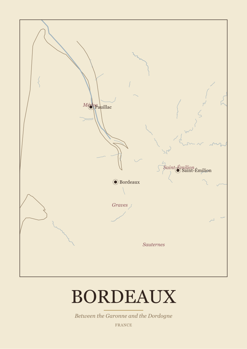 Bordeaux
The print from this article · from €29.95
View the print →
Bordeaux
The print from this article · from €29.95
View the print →
What a Poster Should Refuse to Show, and Why That Refusal Is the Whole Point
We spent as much time deciding what to leave off the sheet as what to put on it. This is the part of the project that no client ever asks about and that determines, more than any other single decision, whether the poster reads as a map or as a menu. A wine map poster of France that tries to show everything ends up showing nothing, because the eye has no hierarchy to follow. Every refusal, in that sense, is a gift to the viewer.
We refused, first, to draw producer names. Not because there is anything wrong with the great houses and estates — many of them are historically fascinating, and the geography of their vineyards is often the geography of the region itself — but because the moment you put a producer name on a poster you have turned a map into an advertisement. The sheet stops being about place and starts being about which brand paid to appear in which font. A good wine map poster of France names the region, sometimes the sub-region, occasionally the anchor town. It does not name the château, the estate, the domaine, or the maison. Those belong on labels, not on maps.
We refused, second, to draw tasting information. No adjectives for the wines, no colour codes for grape varieties, no small icons showing whether a region makes red or white or sparkling. Not because that information is uninteresting — it is often the very information a wine drinker most wants — but because the poster's job is to show geography, and every graphic element you add for something other than geography competes with the geography for the reader's attention. If you want to know what the wines of Champagne taste like, drink one. If you want to know why Champagne is where it is, look at the map. Those are two different questions, and they deserve two different objects.
We refused, third, to draw the appellation borders as sharp black lines. This is subtle and it is the decision we most had to defend internally. Appellation borders are legal boundaries. They are the result of committees and negotiations and, in many cases, real intellectual honesty about where a certain style of wine begins and ends. But they are not geographic in the same way that a river or a coastline is geographic. They are agreements laid on top of the land. On the poster we treated them as such — soft, present, not shouting, subordinate to the physical features underneath. A river is drawn firmly. A coastline is drawn firmly. An appellation border is drawn like a whisper, because that is closer to the truth of what it is.
The final refusal is the one that will annoy some readers, and we are at peace with it. We do not identify the "best" region on the poster. We do not rank Bordeaux above Burgundy or Champagne above either. There is no gold star, no crown, no shading to indicate prestige. A wine map poster of France is not a ranking of French wine regions. It is a portrait of the country's wine geography, and geography does not have winners. It has rivers, and slopes, and towns, and borders. Everything else — the reputations, the prices, the vintages, the arguments — happens on top of that geography and can be argued out somewhere else. The map's job is to hold still while the arguments swirl around it.
If you are looking for a physical version of this thinking — a wine map poster of France that treats the country as geography first — you can see the ones we make at our shop. The rest of what we do is written, drawn, and argued about in public.
This started as a piece about what a wine map poster of France should look like, and it turned, somewhere in the second section, into a piece about how to decide what a map should refuse. That was not the plan. The plan was to walk through three regions and describe how we drew them. But once we started writing about Bordeaux as a horizontal, Burgundy as a diagonal line and Champagne as a triangle on chalk, the argument that pulled the piece together turned out not to be about drawing at all. It turned out to be about hierarchy — rivers before regions, geography before appellations, physical features before legal ones — and about the discipline of leaving things off the sheet. The poster on the wall is the visible half of that discipline. The other half is this article.
FAQ
What actually belongs on a wine map poster of France?
At minimum, the country's major wine rivers — the Garonne, the Dordogne, the Marne and the Saône — the Atlantic and Mediterranean coastlines, the anchor cities of each wine region, and the regions themselves labelled at the correct scale. Sub-zones like the Médoc, Saint-Émilion, the Côte de Nuits, the Côte de Beaune, the Montagne de Reims, the Vallée de la Marne and the Côte des Blancs earn their place when a region's internal geography is meaningful, as it is in Bordeaux, Burgundy and Champagne.
Why draw rivers before appellations?
Because the appellations exist where they exist largely because of the rivers. Bordeaux grew between the Garonne and the Dordogne because those rivers connected vineyards to a port. Champagne developed along the Marne because the river cuts through the chalk that defines the region's soils. Burgundy runs parallel to the Saône down a specific slope. Drawing appellations first hides the underlying logic. Drawing rivers first reveals it, so the viewer can read the map as cause and effect rather than as a legal diagram.
Is Bordeaux really best understood as a river geography?
On a poster, yes. Bordeaux is the land between the Garonne and the Dordogne, with the city of Bordeaux itself on the Garonne and Saint-Émilion on the right bank of the Dordogne. The left bank, running north through the Médoc past towns like Pauillac, and the right bank across the Dordogne behave differently, and that difference is a river difference before it is anything else. A map that hides the two rivers hides the reason the region is shaped the way it is.
Why is Burgundy drawn as such a narrow strip?
Because that is what it is. The core of Burgundy on a wine map of France is the Côte d'Or, a slope running roughly from Dijon in the north through Beaune to Nuits-Saint-Georges and beyond. The Côte de Nuits and the Côte de Beaune are two segments of that same slope. Rendering Burgundy at the same visual weight as Bordeaux would exaggerate its footprint and mislead the viewer about its geography. A thin, precise line is the honest choice.
Where does Champagne actually sit on the map?
Champagne sits north-east of Paris, on chalk hills organised around the Marne. Reims is the northern anchor town, Épernay is on the river itself, and Aÿ is a village slightly to the east. The three sub-regions — the Montagne de Reims, the Vallée de la Marne and the Côte des Blancs — form a loose triangle around the river. On the poster this reads as a compact, hilly area, distinct in shape from the flat sprawl of Bordeaux and the linear slope of Burgundy.
Should a wine map poster of France include specific producer names?
No, at least not on a poster that wants to work as geography. Producer names turn a map into an advertisement and shift the viewer's attention from place to brand. A geographic wine map names regions, sub-regions and the towns that anchor them. Producer names, however famous, belong on labels and in specialist guides, where they can be treated with the historical and biographical depth they deserve, rather than reduced to a symbol on a map.
Why leave appellation borders soft rather than drawing them as hard lines?
Because appellation borders are legal agreements laid on top of the land, not physical features of it. Rivers, coastlines and slopes are geographic facts and deserve firm lines. Appellation borders are the result of committees, negotiations and historical accident; they are real and useful, but they are a different kind of object. Drawing them softly on the poster respects that difference and keeps the visual hierarchy honest: physical geography first, human agreements second.
Does a good wine map poster of France rank the regions by prestige?
Ours does not, and we would argue no map should. Ranking is an argument that happens on top of geography and changes with fashion, vintage and personal taste. Geography does not change on that timescale. A wine map poster of France is a portrait of the country's wine geography — the rivers, slopes, towns and borders that make the regions what they are — and it is the wrong object to answer questions about which region is "best". Those arguments belong in glasses, not on maps.
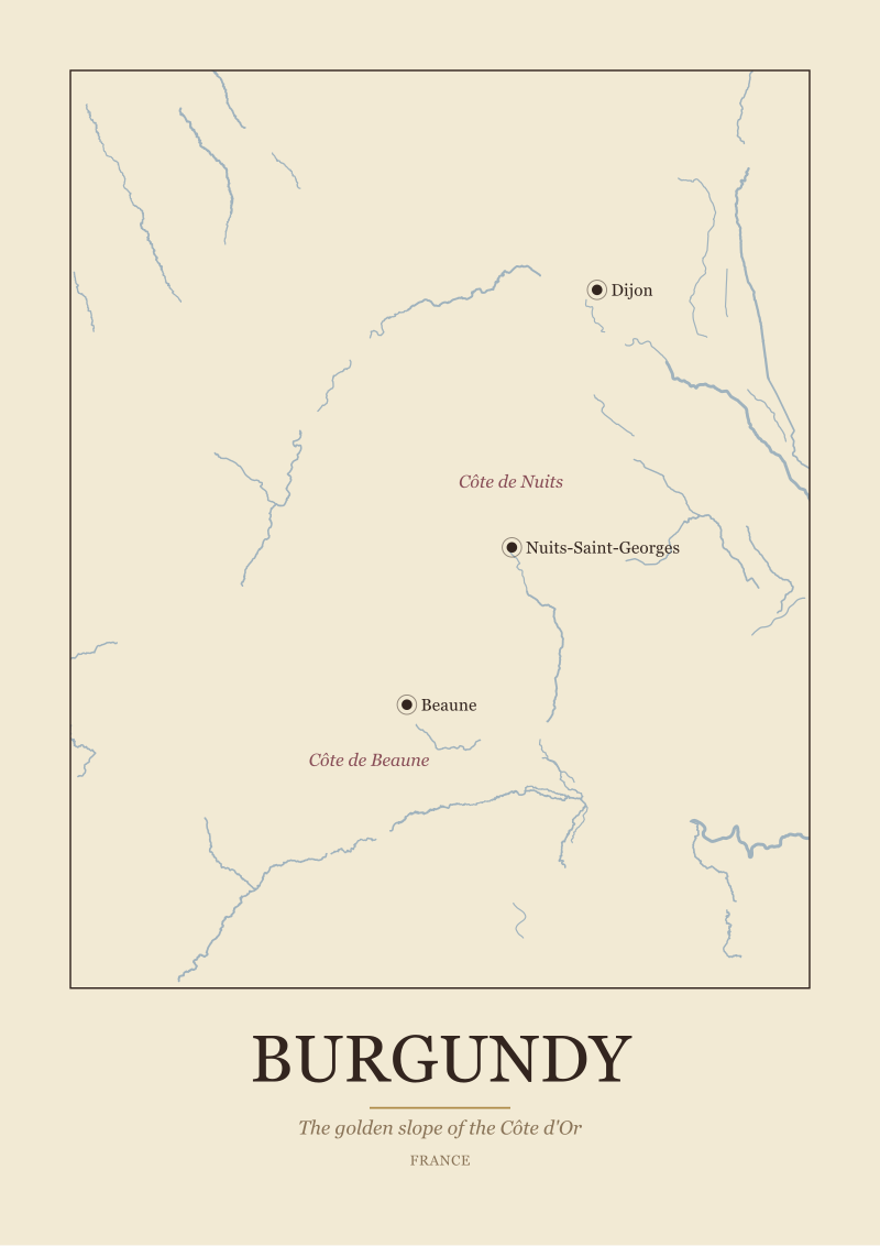 Burgundy
The print from this article · from €29.95
View the print →
Burgundy
The print from this article · from €29.95
View the print →
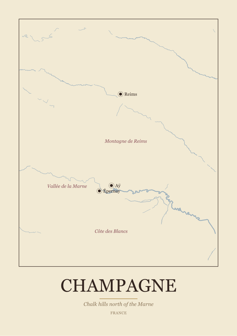
New regions and 10% off your first print.
One email now with your code. No noise after.