We have read most of what the internet writes about the burgundy wine map poster, and the same three omissions appear in almost every piece. The poster is treated as decor. The map is treated as a graphic. The Côte d'Or is treated as a list of names in a column, running from Dijon down through Nuits-Saint-Georges to Beaune, as if the region were a bullet list rotated ninety degrees onto a wall. What almost no one writing about these posters mentions is that the Côte d'Or is a slope above the Saône plain, and the slope is the whole argument.
What They All Get Wrong
The typical burgundy wine map poster, and the typical article recommending one, commits the same category error: it treats the region as a naming problem. The design brief, whether written or unspoken, seems to be this — collect the appellation names, arrange them vertically in some approximation of their real order, letter them beautifully, and print. The result is not a map. It is a menu with cartographic ambitions.
Read enough of these articles and a pattern hardens. The writer opens by saying Burgundy is complicated. The writer says the region has hundreds of climats. The writer notes that the classification is legendary, that the vocabulary is intimidating, that a good poster will help you understand it. Then the writer describes the poster the way you would describe a font specimen. Colours. Weight. Typography. Whether the words are set in serif or sans, whether the framing is white or oak, whether it will look good above a dining table or in a home bar. None of this is wrong, exactly. It is simply beside the point.
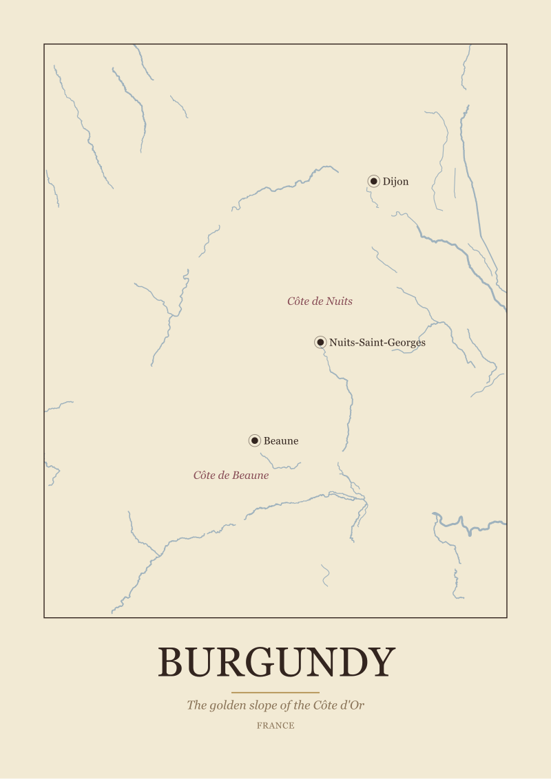
What is missing from that entire register is the fact that the Côte d'Or is a physical thing. It is a narrow strip of hillside, running roughly north to south, on the western edge of the Saône plain. Its subzones — the Côte de Nuits in the north, the Côte de Beaune in the south — are not chapters in a book. They are two segments of the same continuous slope, with the town of Nuits-Saint-Georges sitting near the join, Dijon anchoring the northern end, and Beaune sitting at roughly the midpoint of the whole system. Posters that render this as a stacked list of names, without any indication that the names describe positions on a hillside, have removed the one piece of information that would let a reader understand what they are looking at.
The second recurring error is the erasure of the river. Almost none of the popular Burgundy posters draw the Saône. They draw the appellation boundaries as if the Côte d'Or existed in a vacuum, floating on a beige rectangle. But the slope only means what it means because the Saône plain lies below it to the east. That relationship — hill above, plain below, river beyond — is the geographic sentence the region is written in. Cut the river out of the picture and you have removed the noun the whole slope is predicated on.
What Is Almost Always Missing
Beyond the slope and the river, there is a third omission that is subtler and, in some ways, more damaging. The writing that surrounds these posters almost never explains why anyone should care about a slope at all. The word "slope" appears, if it appears, in the same paragraph as "prestige" and "terroir" and other words that have been sanded smooth by repetition. What is missing is any account of what the slope is actually doing.
A slope that runs north to south with its face turned east is not a scenic detail. It is a solar collector. On the Côte d'Or, that geometry means the vines catch morning sun early, that the hillside warms before the plain, that the wind coming off the Saône is broken by the height of the ridge behind Dijon and behind Beaune. The soils along the slope are not uniform — they vary as the hillside rises and descends, as the underlying rock is exposed at some elevations and buried under wash at others — and the classification that has grown up around those variations, over centuries, is essentially a very slow act of geographic reading. The grand cru band that sits partway up the slope is not there by accident of prestige. It is there because that band, at that elevation, on that exposure, does something specific that the plain below and the plateau above do not.
Most Burgundy poster writing gestures at this and then walks away. It calls the region "the golden slope" — the phrase is grounded in the name itself — and leaves the reader to assume golden means beautiful or valuable, when in fact it also describes what a slope of vines looks like in autumn, low sun catching the leaves. It calls Burgundy legendary and moves on. It rarely says: the reason this piece of ground carries the reputation it does is that the geography, the specific tilt and aspect and drainage of this specific hillside, does something the surrounding country does not. Without that sentence, the poster becomes a coat of arms rather than a map. It signals allegiance to wine. It does not explain the region.
We have read pieces about the burgundy wine map poster that spend nine paragraphs on framing options and two sentences on the region itself. That ratio is the diagnosis.
 Burgundy
The print from this article · from €29.95
View the print →
Burgundy
The print from this article · from €29.95
View the print →
What I Would Say Instead
If we were writing about the burgundy wine map poster from scratch, and if we were writing about it as a piece of geography rather than a piece of decor, we would start with the sentence the region wants us to start with. The Côte d'Or is a slope above the Saône plain. Everything else follows from that.
We would say that a Burgundy poster worth putting on a wall should show the slope as a slope. The line of the hillside should be visible, either as elevation shading or as a clear ridge running north-south along the western edge of the vineyard band. The Saône should be drawn to the east, because the Saône is the reason the slope matters — a hill only reads as a hill when the low ground below it is on the page. Dijon should sit at the northern anchor. Nuits-Saint-Georges should sit where the Côte de Nuits gives way to the Côte de Beaune. Beaune should sit further south, at the town where much of the region's commercial and historical infrastructure has always concentrated. Those three towns are not decoration. They are the coordinate system the region uses to describe itself.
We would draw the two subzones — Côte de Nuits above, Côte de Beaune below — as what they are: adjacent segments of one continuous slope, not two separate regions. The reason to distinguish them on the map is that they behave slightly differently, and their traditional reputations reflect that. The reason to draw them as one continuous band is that they are one continuous band. A map that gives each subzone its own coloured rectangle, separated by white space, is inventing a discontinuity that does not exist in the landscape.
We would keep the poster quiet. The Côte d'Or is roughly fifty kilometres long. It is not visually complicated. A good map of it has a lot of empty space to the east where the plain runs off toward the river, a lot of empty space to the west where the higher country rises behind the vineyard band, and a narrow, careful strip in between where nearly all the argument lives. Filling that empty space with typography or ornament is not respecting the region. It is competing with it.
We draw the Côte d'Or this way in our own studio, and the map lives in our shop alongside the other European regions we render from the same public-domain river and coastline data. But the argument here is not about a particular print. It is about a way of looking at a region that most Burgundy posters, and most writing about them, have quietly agreed to ignore. The slope is the noun. The names on the slope are adjectives. Get the noun right and the rest of the region legibly follows.
The forward question, once you have looked at Burgundy this way, is what other famous regions turn out to be slopes-above-rivers when you draw them properly rather than list them — and that is where the interesting reading of Europe's wine map actually begins.
New regions and 10% off your first print.
One email now with your code. No noise after.