On a Tuesday in February we spread three wine maps across a studio table in Lisbon, weighed the corners with hardback atlases, and laid a Natural Earth river dataset over each in turn. Two were bestsellers from major online print shops. One came from a wine-education brand that has sold, by its own count, more than a hundred thousand posters. We were not looking for taste. We were looking for the Garonne, the Marne, the Côte d'Or ridge, and the borders of Borba, Redondo and Reguengos in the Alentejo. What we found was that subzone accuracy, in the wine-map business, is mostly a marketing word.
The Test: Four Regions, Three Maps, One Ruler
The premise was simple, and the reason we ran it was less charitable than the premise suggests. We were tired of reading product pages that used the word "accurate" the way a wine list uses the word "artisanal" — often, decoratively, and without anyone auditing the claim. So we picked four regions we know well from drawing them ourselves — Bordeaux, Burgundy, Champagne, and the Alentejo — and we picked three maps we did not draw.
The ruler was Natural Earth's 1:10 million rivers and coastline dataset, the same public-domain baseline used by every serious cartographer who does not want to be sued for tracing a copyrighted source. It is not a perfect ground truth for a wine map — Natural Earth is a global reference and it thins detail at the small scale — but for the question we were asking (does the Garonne on this poster actually match the Garonne on the ground, and does the Marne run through the correct hills), it is more than sufficient. If a wine map cannot agree with Natural Earth on where the main river of a region is, the argument is over before it begins.
The three maps, kept anonymous here because we are describing a pattern rather than shaming a specific studio, were: one poster from a large European print-on-demand marketplace, tagged "detailed wine regions of France"; one from a US-based wine-education brand that also sells courses; and one from a smaller print shop that markets its posters as "hand-drawn by a sommelier." We chose them because they show up in the top row when you type "wine map poster" into any large search engine on any given week. They are, in commercial terms, what the reader is most likely to buy.
Our procedure was unglamorous. We printed the Natural Earth layer at the same scale as each poster, aligned it to at least two anchor towns from our grounding — Bordeaux city and Pauillac for the Gironde estuary, Dijon and Beaune for the Côte d'Or, Reims and Épernay for Champagne, Évora and Reguengos for the Alentejo — and then we looked. Not for millimetric perfection; wine maps are stylised objects, and the poster hanging in a kitchen does not need to survey-grade a border. We looked for the kind of drift that would mislead a reader about the geography itself. A subzone drawn on the wrong side of a river. An anchor town off the ridge. A confluence in the wrong place. Errors that change the story of the region, not errors of a millimetre.
We also read what each product page claimed about accuracy. Two of the three used the word explicitly. One used the phrase "subzone accurate." Only one of the three named a source for its base geography, and the source it named was another commercial map. We wrote that down and moved on.
Where the Popular Maps Drift: Bordeaux, Burgundy, and the Marne Problem
Bordeaux was the first honest disaster. Our grounding, boringly, says what every atlas says: Bordeaux is the region between the Garonne and the Dordogne, with the Médoc running north along the Gironde estuary, Saint-Émilion sitting on the Right Bank, and Graves and Sauternes on the Left Bank south of the city. That geography is not obscure. It is the entire reason "Left Bank" and "Right Bank" exist as wine categories in the first place. Yet on one of the three posters, the Dordogne was drawn as a tributary joining the Garonne well upstream of its actual confluence at Bec d'Ambès, which quietly pushes the Saint-Émilion label into territory that has never been Saint-Émilion. On another, the estuary widened correctly but the Médoc appellation shading crossed the Gironde onto the Right Bank for about a centimetre — a rounding error in inches, a category error in wine.
The third Bordeaux map, we will grant, got the rivers right. Its problem was subtler: the internal subzone borders inside the Médoc were drawn as smooth curves, which they are decidedly not. Real appellation borders in Bordeaux follow commune lines, and commune lines follow property, road and old parish geometry. Smoothing them into design-friendly curves is a legitimate stylistic choice for a poster — we make similar choices ourselves — but calling the result "subzone accurate" on the product page is not.
Burgundy was where the maps stopped even pretending. Our grounding calls Burgundy the golden slope of the Côte d'Or, anchored by Dijon, Beaune and Nuits-Saint-Georges, and split into the Côte de Nuits to the north and the Côte de Beaune to the south. In the field this is a thin, roughly north-south escarpment on the western edge of the Saône plain — a wall of vineyards perhaps a couple of kilometres wide, running for about fifty. On two of the three maps, the split between Côte de Nuits and Côte de Beaune was drawn in roughly the correct latitude, but the slope itself was represented as a fat, generous band several times wider than it is on the ground. This is the difference between drawing Burgundy as a region and drawing Burgundy as an idea of a region. On the third map, the Saône itself — the river that defines the plain the escarpment looks out over — was missing entirely. Burgundy, in that map, floated in a beige void.
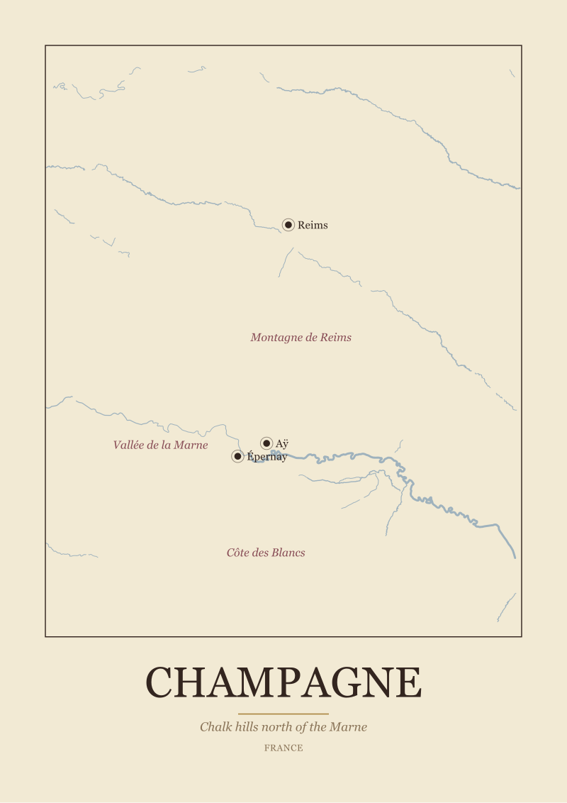
Champagne is where "the Marne problem" earned its name in our notes. Our grounding is explicit: Champagne is the chalk hills north of the Marne, anchored by Reims, Épernay and Aÿ, with three principal subzones — the Montagne de Reims, the Vallée de la Marne, and the Côte des Blancs. The geographic logic is that the Marne flows roughly east-to-west through Épernay, with vineyards climbing the slopes on both banks and continuing north over the chalk ridge toward Reims. Two of the three maps drew the Marne as a north-south river. This is not a small thing. It re-orients the entire region ninety degrees. The Vallée de la Marne is called that because the vineyards follow a valley that runs west; if the river runs north on your poster, the sub-appellation name becomes a mystery instead of an explanation. The third map got the river direction right and then, on the same poster, placed the Côte des Blancs label on the wrong side of the Marne entirely.
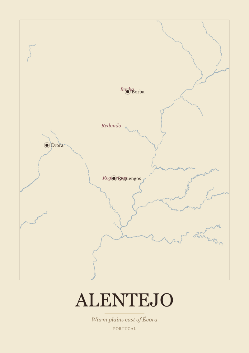
We stopped tallying after Champagne. The Alentejo — Borba, Redondo, Reguengos, all inland from Évora, all east and south of where the Tejo becomes the Guadiana catchment — was represented on only one of the three maps, and that map merged the three subzones into a single yellow blob labelled "Alentejo." Which is a defensible design choice, but again: it should not be sold as subzone accuracy.
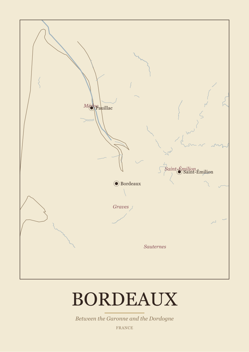 Bordeaux
The print from this article · from €29.95
View the print →
Bordeaux
The print from this article · from €29.95
View the print →
What Accuracy Actually Means When You Draw a Region
Here is what we think, after a decade of drawing these regions ourselves and one long afternoon of measuring other people's work. Accuracy in a wine map is not a single number. It is at least three separate things, and most of the industry conflates them so completely that "accurate" ends up meaning "looks convincing at a glance."
The first accuracy is geographic. Rivers where the rivers are. Towns where the towns are. Coastlines that agree with any public-domain reference the reader might check. This is the easiest of the three to get right, because the data is free and the checks are trivial, and it is also the accuracy that our test found most often violated. If your map cannot place the Garonne, the Saône, the Marne and the Guadiana within a reasonable tolerance of their real courses, no amount of pretty appellation shading can save it.
The second accuracy is appellation. Where the legal border actually runs. This one is genuinely hard, because appellation borders in Europe are defined by administrative texts — commune lists in Bordeaux, parcel-level cadastres in Burgundy, historically negotiated perimeters in Champagne — and they do not always translate cleanly into a single closed polygon. An appellation border is, in a real sense, a legal document rather than a line. Drawing it as a line is always an interpretation. The honest thing to do is say so. The dishonest thing is to draw a smooth designer curve and call it "subzone accurate" on the product page.
The third accuracy is what we would call editorial accuracy — whether the map tells the truth about *why the region is a region.* Burgundy is a slope. Draw it too wide and you have lied about what it is, even if every label is in the correct place. Champagne is chalk hills bracketing a river valley that runs east-west. Rotate the river and the whole logic collapses. The Alentejo is not one place — it is a warm plain with distinct subzones around Évora that produce distinctly different wines, and drawing it as a single blob erases exactly the thing that makes it interesting to visit. Editorial accuracy is the accuracy that separates a map that teaches from a map that only decorates.
We draw the regions on our own shop with a specific answer to all three of those questions, and we publish our geographic source for each print. That is not a claim of perfection — no wine map is perfect, ours included — it is a claim of accountability, which is a different and much cheaper thing to offer. If you are buying a wine map from anyone else, the useful question is not "is this accurate?" but "accurate about what, and against which reference, and would you show me the check?" The three shops we measured this month would answer that question in three quite different ways, and only one of them would answer it at all.
Which brings us to the next problem, and it is the one we did not solve on that Tuesday in February. Even a map that gets every river right and every commune line correct has still made a design choice about what to leave out — the smaller subzones inside Saint-Émilion, the climats of the Côte d'Or, the sub-appellations of the Alentejo that do not fit on a poster. That is the honest limit of the medium, and it is where the real editorial argument about wine cartography starts. It is not where this piece ends, but it is where the next one begins.
FAQ
What does "subzone accuracy" mean on a wine map?
Nothing standardised, which is part of the problem. In our reading it should mean two things at once: that the boundaries of the sub-appellations shown on the map correspond to their real legal perimeters within a stated tolerance, and that the geographic base underneath them — rivers, towns, coastlines — matches a public reference. Most shops we surveyed use the phrase without defining either half, and without naming the source they measured against.
Which base data should a serious wine map use?
For rivers and coastlines, Natural Earth's public-domain layers are a defensible baseline at poster scale, and OpenStreetMap adds finer detail where you need it. For appellation borders, the reference is the administrative text of the appellation itself — commune lists in Bordeaux, INAO documents in France more broadly, IVV data in Portugal. A map that will not name its base data is a map that does not want the check.
Are the errors you found visible to a casual reader?
Some are, some are not. A misplaced Marne rotated ninety degrees is obvious to anyone who has visited Champagne. A Médoc appellation that spills a centimetre across the Gironde is invisible until you overlay a river dataset. The dangerous errors are the second kind, because they survive scrutiny at the poster stage and only cause problems when a reader uses the map to think about the region.
Why did you keep the three shops anonymous?
Because the pattern is more useful than the pillory. All three of the maps we measured are still on sale, and two of them are sold by very well-known brands. Naming them would turn the piece into a fight about individual products; leaving them anonymous keeps the focus on what "accurate" is being used to mean across the whole category. Any reader who wants to run our test can do it in an afternoon.
Does a stylised wine map need to be geographically precise at all?
It depends on the promise the shop makes on the product page. A poster sold as "artistic interpretation of the wine regions" can bend geography freely — that is a legitimate genre. A poster sold with the word "accurate" is making a claim, and the claim should be auditable. Our objection is not to stylised maps. It is to stylised maps that market themselves in the vocabulary of the survey office.
What is the single most common error you saw?
Rivers drawn from memory rather than from data. The Garonne, the Marne and the Saône were all misplaced or misdirected on at least one poster in our sample, and once the river is wrong, everything downstream of it — literally — starts to drift. Vineyards climb slopes that face specific directions; hills rise where specific rivers cut through specific rock. Get the river wrong and the region stops making sense.
How would you audit a wine map before buying one?
Look for three things on the product page: a named source for the base geography, a named source for the appellation borders, and at least one anchor town whose position you can verify against any online atlas. If those three are present, you are dealing with a shop that expects to be checked. If none of them are present, the word "accurate" on that page is doing marketing work, not cartographic work.
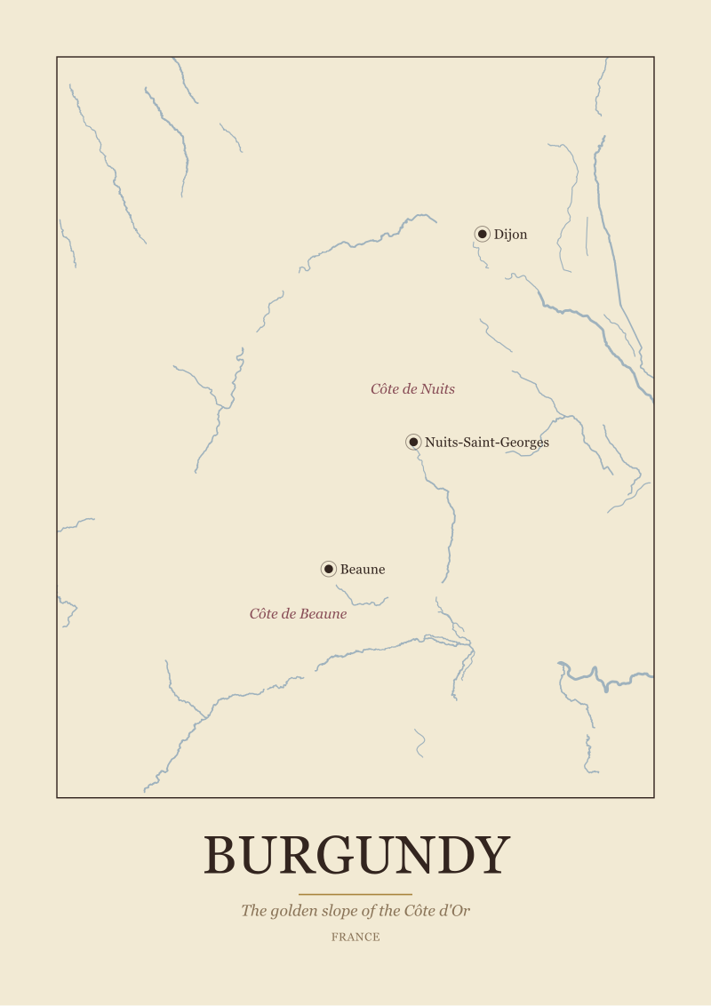 Burgundy
The print from this article · from €29.95
View the print →
Burgundy
The print from this article · from €29.95
View the print →
New regions and 10% off your first print.
One email now with your code. No noise after.