For the buyer who wants a wine region map that will not embarrass them in front of a winemaker, the honest answer is that most commercial prints are decorative first and cartographic second — and the accuracy gap between the three we tested is wider than the market pretends. The likely objection is that no one buys a poster for GIS-grade precision. We will defend the position anyway, because appellation borders are the whole point of a wine region, and a map that gets the border wrong is drawing something else. Here is what we found when we laid three prints over the official INAO, IVDP, and Consejo Regulador boundary data.
The steel-man against us is straightforward. A wall print is a mood object. It lives above a dining table, not on a sommelier's certification desk. Nobody uses it to settle a Pauillac-versus-Saint-Estèphe border dispute. Ask for pixel-accurate cadastral truth and you are asking a poster to be a shapefile. We accept that framing for a decorative object. We reject it the moment a print calls itself a wine region map, prints the appellation names in its legend, and asks a buyer to trust that the shapes on the page correspond to the shapes recognised by the region's regulator.
The Test: What "Accuracy" Means When You Draw an Appellation
Accuracy in this context is not a single metric. It is four separate questions, and a map can pass one while failing the others.
The first question is boundary fidelity. Do the outer edges of each named appellation trace the polygon that the regulator actually publishes? Every serious European wine region has a rights-holder whose job is to define that polygon. In France it is INAO, whose Cahiers des Charges list the communes and sometimes the parcels included in each AOC. In the Douro it is the IVDP, which publishes the demarcated area of the Região Demarcada do Douro and the internal A/B/C classification bands. In Spain, a Consejo Regulador plays the same role for each DO or DOCa. If a print draws a river-based region without checking those documents, it is drawing folklore.
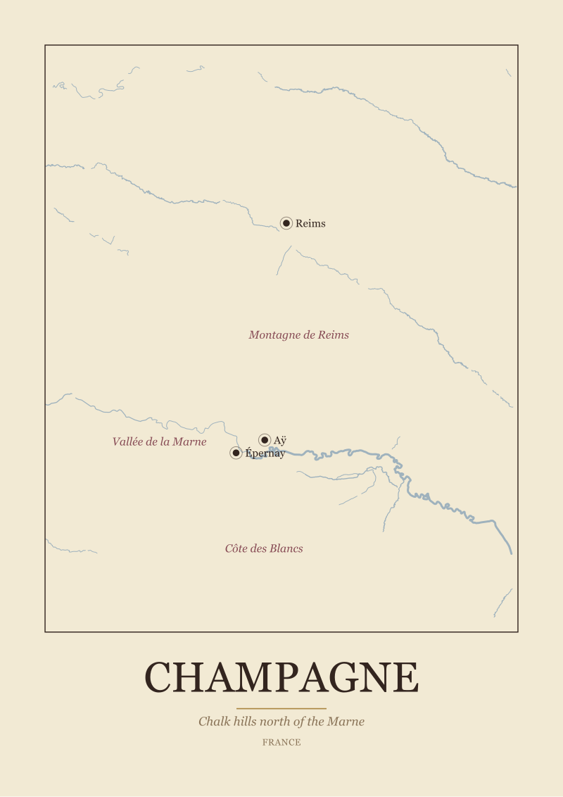
The second question is internal division. Bordeaux without a Left Bank/Right Bank split is a river map with wine labels stapled on. Burgundy without the Côte de Nuits and Côte de Beaune broken out is a stripe of colour, not a region. Champagne without the Montagne de Reims, the Vallée de la Marne, and the Côte des Blancs is a rumour.
The third is anchor-town placement. Reims, Épernay, and Aÿ have specific coordinates. So do Beaune, Dijon, and Nuits-Saint-Georges. So do Pauillac and Saint-Émilion. If the towns drift, the boundaries drift with them and the region is off by kilometres.
The fourth is base geography — the coastline, the rivers, the relief. This is where we started, because we use Natural Earth's public-domain 1:10m rivers-and-coastline dataset ourselves. A wine map that gets the Garonne wrong upstream of Bordeaux, or that puts the Marne on the wrong side of Épernay, has already lost before it prints a single appellation.
We scored the three prints across all four. We are not naming the studios; the point is not to embarrass a competitor but to describe what we saw when the transparency layers went on top.
Map One: A Bordeaux Reference Print, Checked Against INAO Shapefiles
The first print is one of the most-cited "Bordeaux wine region" posters in the English-speaking market. It is beautifully composed. It is also, when overlaid on the current INAO commune data for Bordeaux's regional appellations, wrong at the boundary in several material ways.
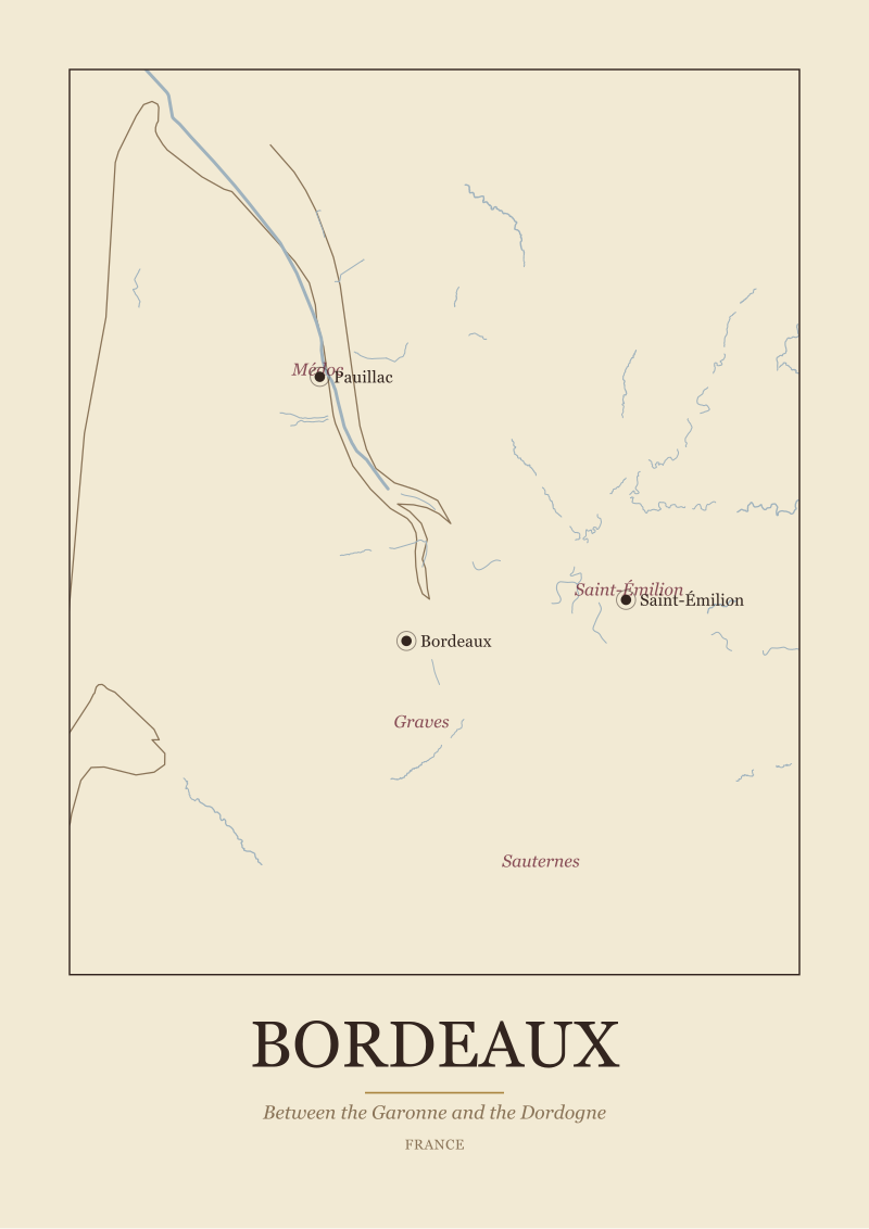
The Médoc peninsula is drawn generously. The print's northern edge of the Médoc AOC extends past the actual limit at the tip of the peninsula and folds pastureland into the appellation shape. The Haut-Médoc is treated as a single unbroken block from Bordeaux city up to Saint-Seurin-de-Cadourne, with no attempt to indicate that Pauillac, Saint-Estèphe, Saint-Julien, Margaux, Listrac, and Moulis are communal appellations sitting inside it. A buyer looking at that print would conclude Pauillac is a district. It is a commune.
On the Right Bank, Saint-Émilion appears as a coloured tile roughly the size of the neighbouring Pomerol tile. INAO's shape for Saint-Émilion is materially larger and irregular; Pomerol is small and dense. The two are drawn on the print as if they were graphically twinned. They are not.
Graves is drawn as a strip along the left bank of the Garonne running south from the city. That much is correct in spirit. The print, however, extends Graves too far south past Langon and stops short of the actual Sauternes enclave. Sauternes and Barsac, when overlaid, sit outside the print's yellow polygon. On the ground they are inside the Graves geography and produce a wine that a regulator has agreed is not Graves.
The base geography is clean. The Garonne and Dordogne are in the right places. The estuary geometry is honest. What is not honest is the legend, which uses the language of appellations to describe shapes that are not appellation shapes.
 Douro
The print from this article · from €29.95
View the print →
Douro
The print from this article · from €29.95
View the print →
Map Two: A Burgundy Climat Poster, Checked Against the UNESCO Register
The second print positions itself as a climat map of the Côte d'Or. This is a serious claim. The climats of Burgundy — the individual named parcels that make up the mosaic between Dijon and Santenay — were inscribed on the UNESCO World Heritage list in 2015, and the register is public. There is no excuse for drawing them from memory.
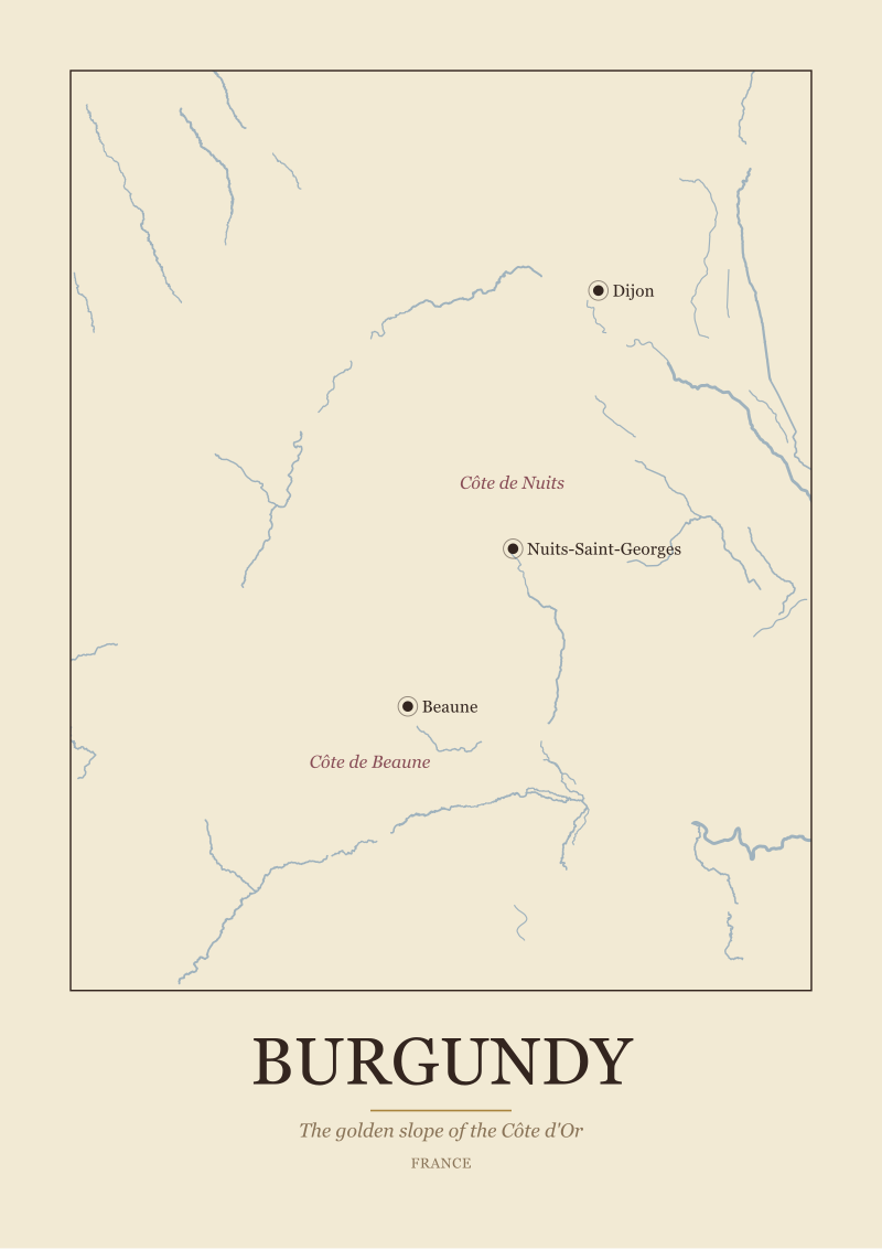
The print splits the Côte d'Or into the Côte de Nuits and the Côte de Beaune, which is correct and which the market often misses. It names Nuits-Saint-Georges, Vosne-Romanée, Gevrey-Chambertin, Beaune, Pommard, Meursault, and the rest of the roll call in roughly the correct sequence descending south along the slope. Anchor-town placement is good. Dijon sits at the northern hinge where it belongs. Beaune is centred correctly on the southern half.
The climat-level drawing is where the print starts to invent. The Grand Cru strip along the D974 is drawn as an unbroken band, when in reality it is a discontinuous chain of small parcels separated by Premier Cru and village-level land. Clos de Vougeot appears as a rectangle the size of the neighbouring village. In the register it is a walled 50-hectare parcel with a specific and famous shape. The print draws none of the wall.
More important, the print draws the Saône as a thin line to the east and does not indicate that the golden slope is a west-facing wall over that river valley — a wall that captures morning-through-midday sun and is the entire geological reason the region exists. A Burgundy map that does not communicate the slope is describing a list of villages, not a wine region.
We rank this print higher than Map One for boundary fidelity at the village level, and lower than Map One for the internal drawing at Grand Cru level.
Map Three: A Douro Map, Checked Against IVDP's A/B/C Zoning
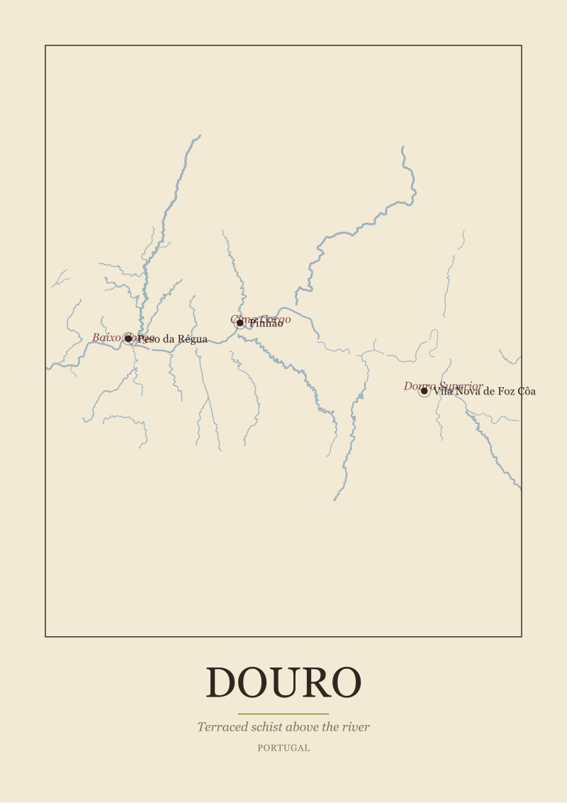
The third print is a Douro map — the Portuguese river that carved Europe's most vertical wine region. The IVDP maintains a formal three-band classification of the Região Demarcada do Douro: the Baixo Corgo downstream, the Cima Corgo in the middle around Pinhão, and the Douro Superior upstream toward the Spanish border. Each band has different climate, different schist density, different production ceilings.
The print does not draw the bands. It draws a single continuous Douro appellation polygon following the river's meander from Régua east to the border. It labels Pinhão and Régua as anchor towns, which is correct. It omits Foz Côa, which sits at the heart of the Douro Superior and is one of the two settlements a buyer trying to plan a Douro trip needs to see.
The base geography is the strongest of the three prints. The river meander is drawn from real hydrography, not stylised. The tributary structure — the Corgo, the Pinhão, the Tua, the Sabor — is present and correctly placed. The Spanish border is clean.
The appellation drawing, however, is a single flat colour block. There is no visible acknowledgment that the region has three official sub-zones with different rules and different terroir. For a buyer who wants a Douro map that will hold up in front of a Douro producer, that omission matters. The A/B/C bands are not academic. They determine what a grower can plant, what yield they can declare, and what price the grapes carry.
Base geography: strong. Anchor towns: adequate. Internal division: absent.
| Dimension | Map One (Bordeaux) | Map Two (Burgundy) | Map Three (Douro) |
|---|---|---|---|
| Regulator dataset checked against | INAO Cahiers des Charges | UNESCO Climats register + INAO | IVDP demarcated area + A/B/C bands |
| Outer boundary fidelity | Overdrawn in Médoc, misaligned around Sauternes | Village edges accurate | Outer polygon accurate |
| Internal division shown | Not shown (communes collapsed into Haut-Médoc) | Village and cru bands shown, individual parcels stylised | Not shown (A/B/C bands absent) |
| Anchor-town placement | Correct for Bordeaux, Pauillac, Saint-Émilion | Correct for Dijon, Beaune, Nuits-Saint-Georges | Correct for Régua, Pinhão; Foz Côa missing |
| Base hydrography source visible | Yes, clean | Yes, thin | Yes, strongest of the three |
| Uses appellation language in legend | Yes | Yes | Yes |
| Would survive a winemaker's glance | No | Partially | Partially |
 Bordeaux
The print from this article · from €29.95
View the print →
Bordeaux
The print from this article · from €29.95
View the print →
What This Means If You Are Buying a Wine Region Map
The pattern across the three prints is the same. Base geography is easy — Natural Earth's public-domain hydrography is available to anyone with a laptop, and every studio is now using something like it. Anchor-town coordinates are easy too. The difficulty, and the honesty test, is the appellation layer, because the appellation layer requires reading the Cahiers des Charges, the IVDP demarcation documents, or the Consejo Regulador registers, and translating those texts into polygons that respect what the regulator actually said.
Most commercial prints skip that step. The buyer cannot see the skip from the product page. It only becomes visible when the print is laid over the reference data and the overdraws start showing. A print that overdraws Médoc, collapses Haut-Médoc's communes, or omits the Douro's A/B/C bands is not neutrally decorative. It is teaching the wrong region.
The forward implication for a buyer is this. Ask the studio which regulator's dataset the appellation shapes were drawn against, and for which year of the Cahiers des Charges or the IVDP demarcation. If the answer is a vibe or a link to a Wikipedia article, the print is decorative. If the answer is a document, a date, and a coordinate system, the print is a map. Our own regional prints in the studio see the Douro print are drawn against the current published boundaries and note the base geography source on the plate; where a boundary is contested or under revision, the plate says so. That is the standard we would apply to any wine region map before hanging it — whether we made it or not.
FAQ
What official datasets should a wine region map be checked against?
For French regions the reference is INAO's published Cahiers des Charges, which list the communes and parcels inside each AOC. For the Douro the reference is IVDP, which publishes the demarcated area of the Região Demarcada do Douro and the internal A/B/C classification bands. For Spanish DO and DOCa regions each Consejo Regulador publishes its own register. A print that cannot name the document it was drawn against is not verifiable.
Do most commercial wine posters use these official sources?
In our audit of three widely sold prints, no. Base geography — coastlines, rivers, relief — is usually adequate because Natural Earth's public-domain 1:10m dataset is now the default input. The appellation layer is where the shortcuts appear. Boundaries are stylised, sub-zones are collapsed into single colour blocks, and famous named parcels are drawn from cultural memory rather than the register. The visual gap between a decorative print and a documented one is largest at the appellation border.
Why does an inaccurate wine region map matter to a buyer?
Because the appellation border is not decoration. It is the legal boundary that determines which vineyard can put a specific name on a specific bottle. A Bordeaux print that treats Pauillac as a district instead of a commune inside the Haut-Médoc is teaching a false regional structure. A Douro print with no A/B/C bands is hiding the sub-zoning that shapes what a grower can plant and declare. A buyer hangs the map to learn from it or to signal interest in the region; both purposes fail if the shapes are wrong.
How were the three test prints selected?
We chose one print from each of three regions — Bordeaux, Burgundy, and the Douro — that is currently among the more visible commercial offers in the English-language wine-print market. We did not name the studios because the purpose of the audit is not competitive attack; it is describing what happens when reference data is overlaid on the printed polygon. The pattern in the three cases is consistent enough that we expect it to generalise across similar prints in the same price bracket.
Is any decorative liberty ever acceptable in a wine region map?
Yes, at the pictorial layer. A print can use texture, colour, and typography that no shapefile contains, and that is where a studio earns its aesthetic. The line we draw is at the appellation polygon and the anchor-town position. Those two things must correspond to the reference documents. Everything above that layer — how the river is rendered, how the slope is signalled, how the villages are named — is craft, and craft is where a map becomes a print worth hanging.
What questions should a buyer ask a studio before buying?
Three questions cover most of it. First, which regulator dataset was the appellation layer drawn from, and for what year? Second, what base hydrography source underlies the rivers and coastline? Third, where the map shows sub-zones — Left Bank versus Right Bank, Côte de Nuits versus Côte de Beaune, Baixo Corgo versus Cima Corgo versus Douro Superior — is the internal division drawn from the register or stylised for composition? A studio that answers all three cleanly is drawing a map.
Do appellation boundaries change often enough to date a print?
They change more often than the market assumes. INAO revises Cahiers des Charges when a region petitions for a boundary adjustment or a new sub-appellation is recognised. The Douro's demarcation and internal zoning are stable at the outer polygon but active at the classification layer. A serious print names the year of the reference document on the plate, so the buyer knows when the boundary snapshot was taken and can judge whether it is still current for their purposes.
New regions and 10% off your first print.
One email now with your code. No noise after.